Container Cabin by the Coast
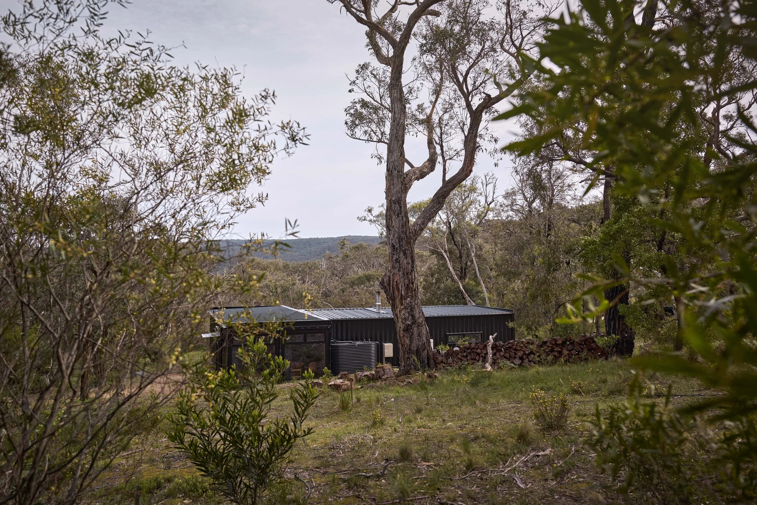
A shipping container house in Aireys Inlet rightly heroes its exquisite setting: a precious remnant of open woodland. Cantilever helped design-savvy friends create a sustainable home that’s equal parts hip hotel and bird-hide, ideal for enjoying the towering Eucalypts, rare orchids, and unruly orchestra of birds.
Tamsin O’Neill and Tom Bodycomb don’t do things by halves. Four years ago, the publishers of Green magazine and Walkers Journal moved from inner Melbourne, renting in Mogg’s Creek on the Great Ocean Road to prepare for a new life that was calling them on the rugged west coast. Keen travellers, hikers, swimmers (Tamsin) and surfers (Tom and adult kids Roma and Sammy), this was a family all-in for the next adventure. Sustainable living would be central, but they were open about the rest.
““We wanted to be here somehow, close to the water, but we didn’t just want to live in a beach house.” ”
When the couple heard about a bush-block for sale in Aireys Inlet, they grabbed Sammy, who was studying botany and volunteering with local land care group Angair at the time.
On arrival, all three knew they’d found their next step.
““It’s on a western facing slope a few hundred metres up from the Painkalac Valley, and a similar distance from the coastal limestone cliff-line to the south,” Sammy explains. “It’s slightly shy of one hectare, and supports a well-intact patch of sandy, herb-rich woodland, sparsely shaded by a canopy of … Messmate, Manna Gum and Red Ironbark.” ”
The understory of Acacia Wattle, Cherry Ballart and Coast Beard-heath is stunning. But the diversity of the abundant ground-layer – shrubs, grasses and wildflowers including rare native orchids that look like the blown glass work of artists – is otherworldly. As for the majestic Wedge tailed Eagles circling high above on the thermals before dive-bombing the startled Kookaburras, Wattlebirds and Spotted Pardalotes below. You get the picture.
“It was beyond our means, but we fell in love with it,” Tasmin recalls. Within a week they’d prevailed in Covid-era online auction and “had to figure out how we were going to build on it for the least amount of money possible,” she adds with a laugh. Raised by families of architects and DIYers, and after a lifetime publishing stories about ingenious, compact, sustainable homes and glamping experiences to die for, Tamsin and Tom weren’t short on design ideas or the network to bring them to life.
Nor were they paralysed by choice. They soon settled on a prefabricated home made from four 40-foot shipping containers as the cheapest, quickest, most adaptable and least destructive option. The minimal, robust metal form was appealingly dark like the surrounding Ironbark, bushfire-resistant, and easily oriented, insulated and specified for maximum spatial and energy efficiency. Craning it in, mounting it with screw pile footings into small concrete pads, and cantilevering a portion over the landscape minimised the earthworks required to nestle it into a sheltering hillside to the rear. Redistributing soil filled with original seeds protected rare beauties like Spotted Hyacinth Orchids and Nodding Greenhoods, which are already reappearing.
A T-configuration provides a hardworking, comfortable home in just 115-square-metres. With help from Tamsin’s sister Rema (drawings and energy efficiency) and Sonic Steel (fabrication), their design opens two containers length-ways to create a kitchen, dining and living space, with massive windows and glazed doors to capture the wondrous views this place is all about. At its centre are a structural steel post, a cherished timber dining table belonging to Tamsin’s late father, and a small combustion fireplace. It’s the only heating required in a compact house that’s carefully oriented for winter sun and as well-sealed and serenely quiet as a Passive House.
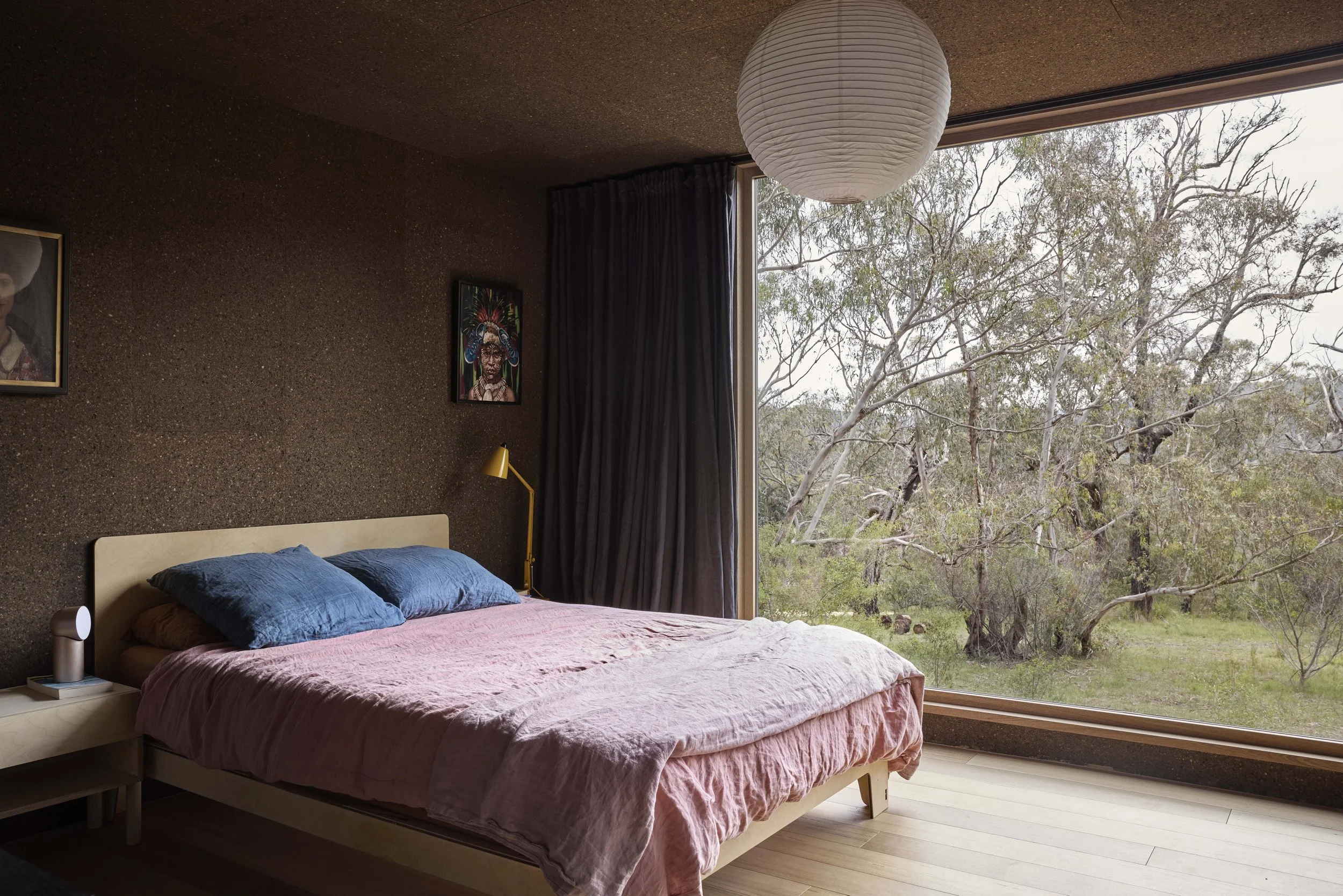
The living zone is capped by two containers (themselves capped by more massive windows) accommodating a generous master-come-home-office and two smaller bedrooms for visiting kids or guests. They’re cleverly linked by a Cantilever-designed services corridor concealing Euro laundry and walk-in robe. Small, darkly glamourous bathrooms (one with bath, the other with shower) resemble hip hotel rooms. Custom K1 joinery includes a high-level display shelf for artwork, made possible by a heat recovery ventilation system that ensures condensation-free living no matter how hot the bath water.
The couple say their friends Kylie Forbes and Travis Dean of Cantilever were always their first choice for a robust, durable, hardworking kitchen and unifying joinery in the living/dining area, laundry zone and bathrooms.
““They totally got us, and knew what we wanted. We were happy to invest in a kitchen of this calibre because we were guaranteed they were going to do a really good job and that we could work well with them.” ”
Kylie describes this as a joyful project driven by Tamsin, Tom and Rema’s clear design direction.
““The first cup of tea on the block revealed their vision of repurposed shipping containers, solid in their dark silhouette against the shifting trees, I could so easily see the house sitting there on the sandy slope.””
“Tamsin and Tom had a strong concept for a dark interior that was minimal in material variety. I interpreted they wanted to maximise the light held in the landscape, with the focus outward from the space. Conceptually, the interior was to be clad in black ply, but materially this had barriers in application to the container modules, so we considered cork as a substitute. This brought a completely unique feel to the space. The colour is so rich, glowing and earthy.
“There were many conversations about possible specifications, materiality, function and flow of the spaces. Early discussions centred on kitchen and living floorplan and scale, what to do with the fireplace, how to make the living sit next to the kitchen, where to place the dining table.
They were content with minimal storage, and focused on function and a simplicity of design. No overheads, with display space preferred, integration of window positions, VZug appliances, and the gentle materiality of K3.6, with its custom concrete and stainless steel benchtops, exposed ply and handle cut-outs. Dark green SoftTouch was an immediate selection by Tamsin and Tom. It complements the Moss Concrete benchtop, which offers a beautiful matte, textured finish. So subtle. It enhances the connectivity with the surrounding trees and scrub. Your eye links them easily.”
Tamsin credits Kylie with elevating their vision for a long kitchen bench tapering into a daybed. Cantilever created beautiful banquette seating with concealed storage, and incorporated more display shelving for original artwork – some by Tamsin, some collected by her Dad over many years. Against the deep, warm neutrality of walls and ceiling clad in charred Portugal Cork tiles, absorbing bright light as well as sound, this is an interior where colour really pops.
““The contrast of the lighter material accents adds literal dimension to the space. We combined tonal variety within the lighter shades, and kept a tight dark spectrum. The lighter shades combine complimentary creams, whites, taupe and timber, which hover against the darker greens, browns and blacks, allowing them to recede as a backdrop.” ”
From Tom’s perspective, Cantilever’s skillful spatial planning proved pivotal to the design’s success. He says Travis’ elegant solution of flipping the laundry on its side to create a functional corridor (which closes off to bedrooms via sliding doors) resolved not just tight programming and storage but the structural challenge of opening up shipping containers while minimising the use of load-bearing beams and posts. “It’s unusual, but it works,” he says. “And it gives us another passageway, where we can go to the shower from our bedroom in privacy, even with people here.”
Kylie concedes the home’s steel structure meant less flexibility than a regular project in the positioning of services. “We needed millimetre accuracy for perfect integration,” she explains. But she and Travis were unfazed by the myriad other challenges associated with the laundry zone.
““Working from a refurb perspective rather than a new build perspective does help us maximise outcomes within boundaries,” she says. “The container modules do offer very firm boundaries. We are good at Tetris!””
Forage + Find | K3 Palette Series


