K3 – A much loved staple
Designing more sustainable solutions for joinery has long been an interest and priority of Cantilever’s product development. The early days of Cantilever saw us hone our trade in a more traditional sense, by making joinery for projects designed by architects. Immersed in the progressive inner north construction ilk, the furniture making traditions of the team led our interest and ability to test and explore materials, the catalyst of our product design journey.
Project
K3 Feature
System
K3 Kitchen System
Service
Joinery Design and Manufacture
Author
Carly Cleveland
Images
Martina Gemmola
Key Suppliers
Sussex Taps
Miele
V-ZUG
Urban Edge Ceramics
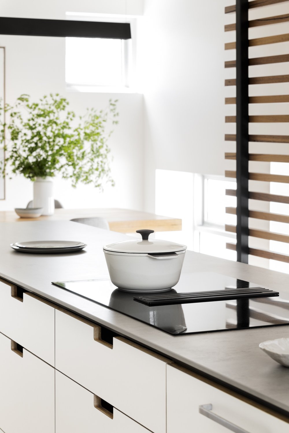
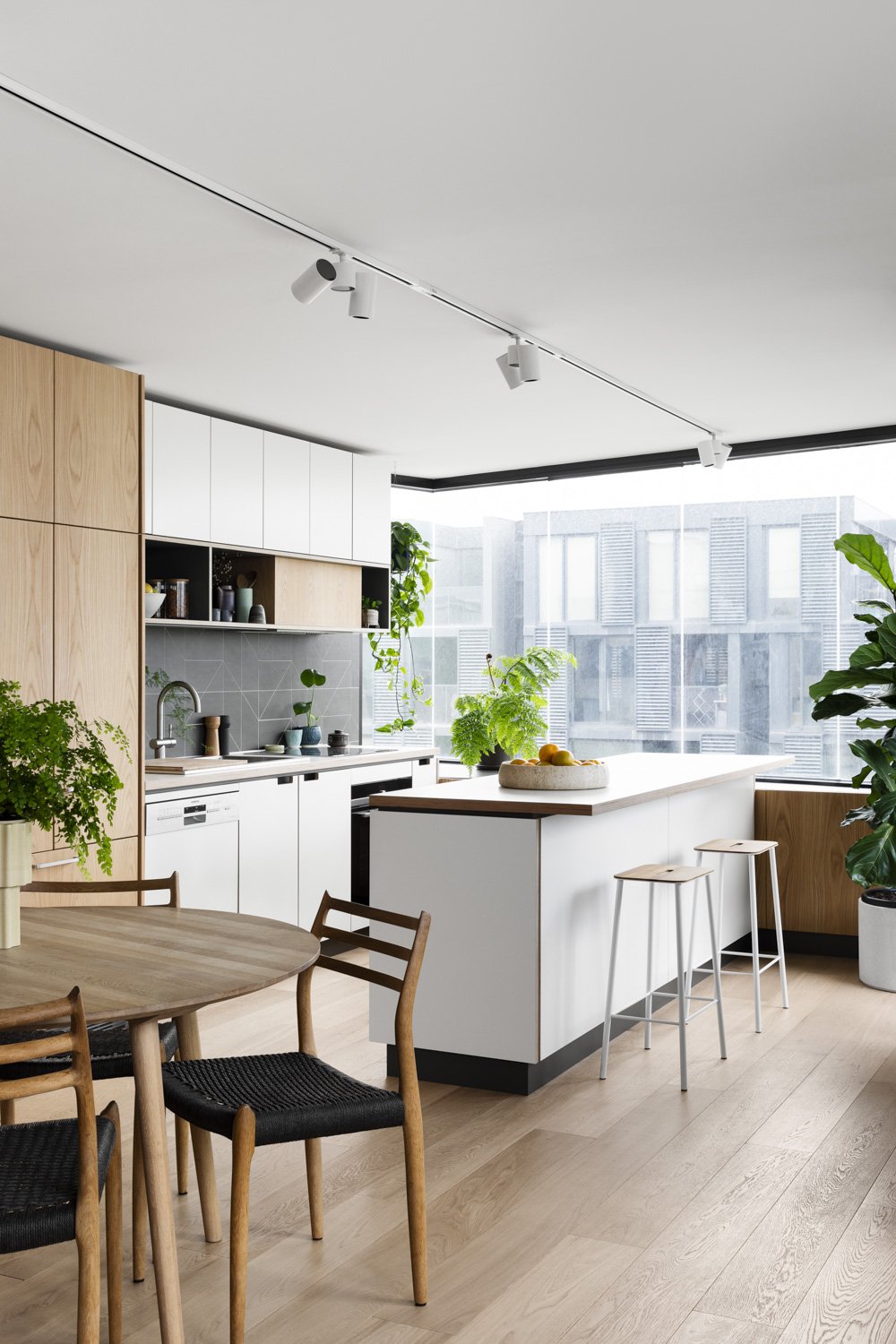
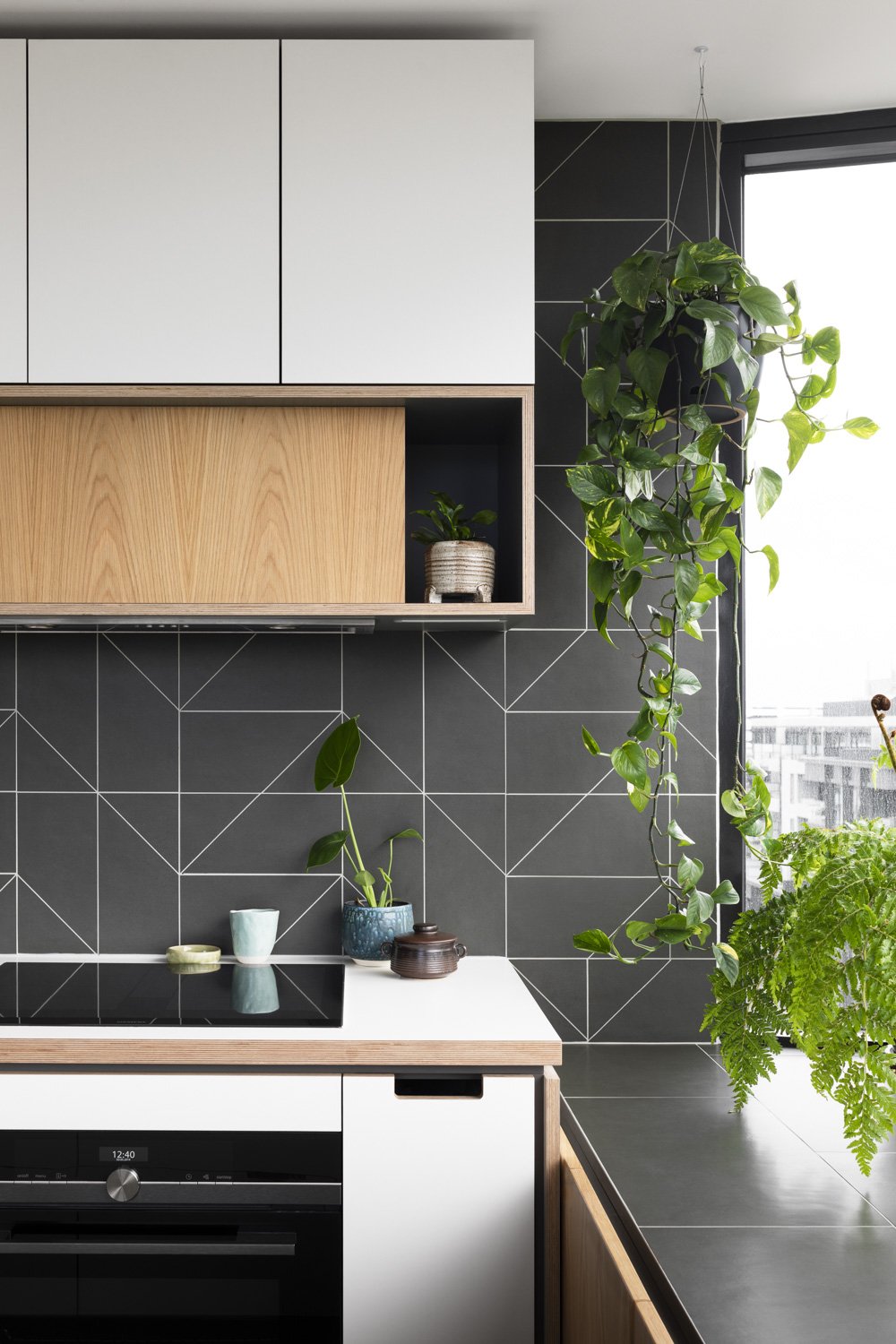
K3 Kitchen System refined our use of Laminate on ply, expressed by the square cut out handle, finished with lacquer and sanding, by hand. The material expresses a playful nod to mid-century modern, the pared-back design of the square cut out handle harnesses crisp clean lines, exposing hints of timber warmth. Laminate on ply is where nostalgia meets conscious resolve: a perfect match to coastal, mid-century, and Australian Modern interiors. Every Cantilever Kitchen System has been designed based on a set of cabinetry and hardware solutions, to be interpreted to the site nuance and built to the exact millimetre.
At Cantilever, we are environment minded in our design approach with company standards on longevity, functionality, and durability which are applied to every project. We believe in making products that not only serve our clients well but also have the best chance of not ending up in landfill. By designing for longevity, you can keep the kitchen you love, for longer. Cantilever’s K3 System increases the longevity of your kitchen through its use of quality materials and craftmanship, both factors increasing the products’ lifespan.
With a playful nod to mid-century modern, the pared-back design of the K3 Kitchen System harnesses crisp clean lines, exposing hints of timber warmth.
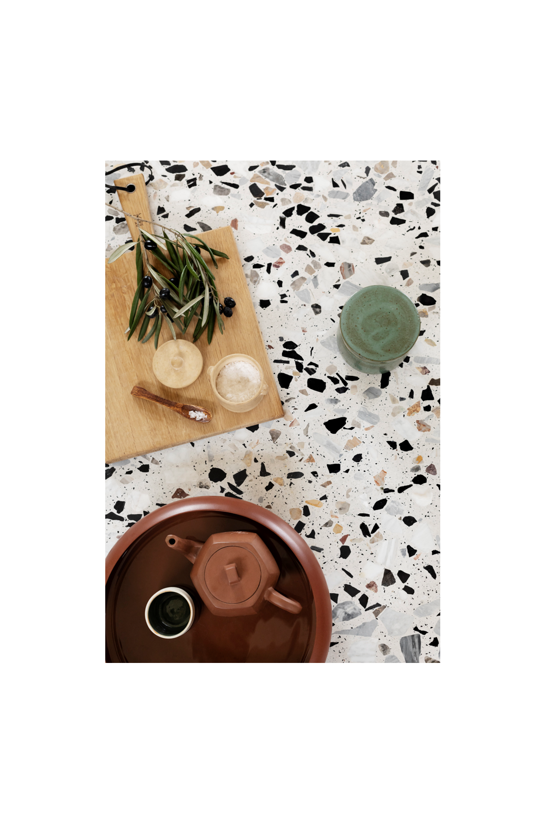
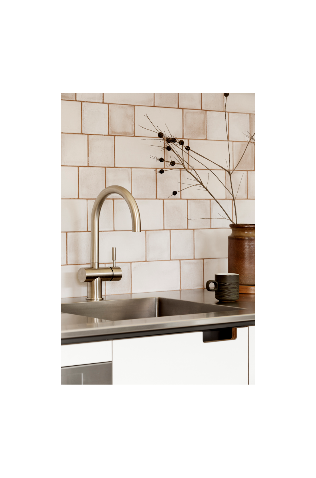
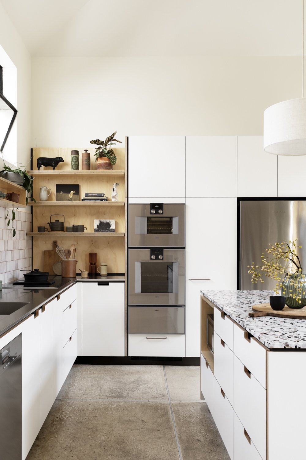
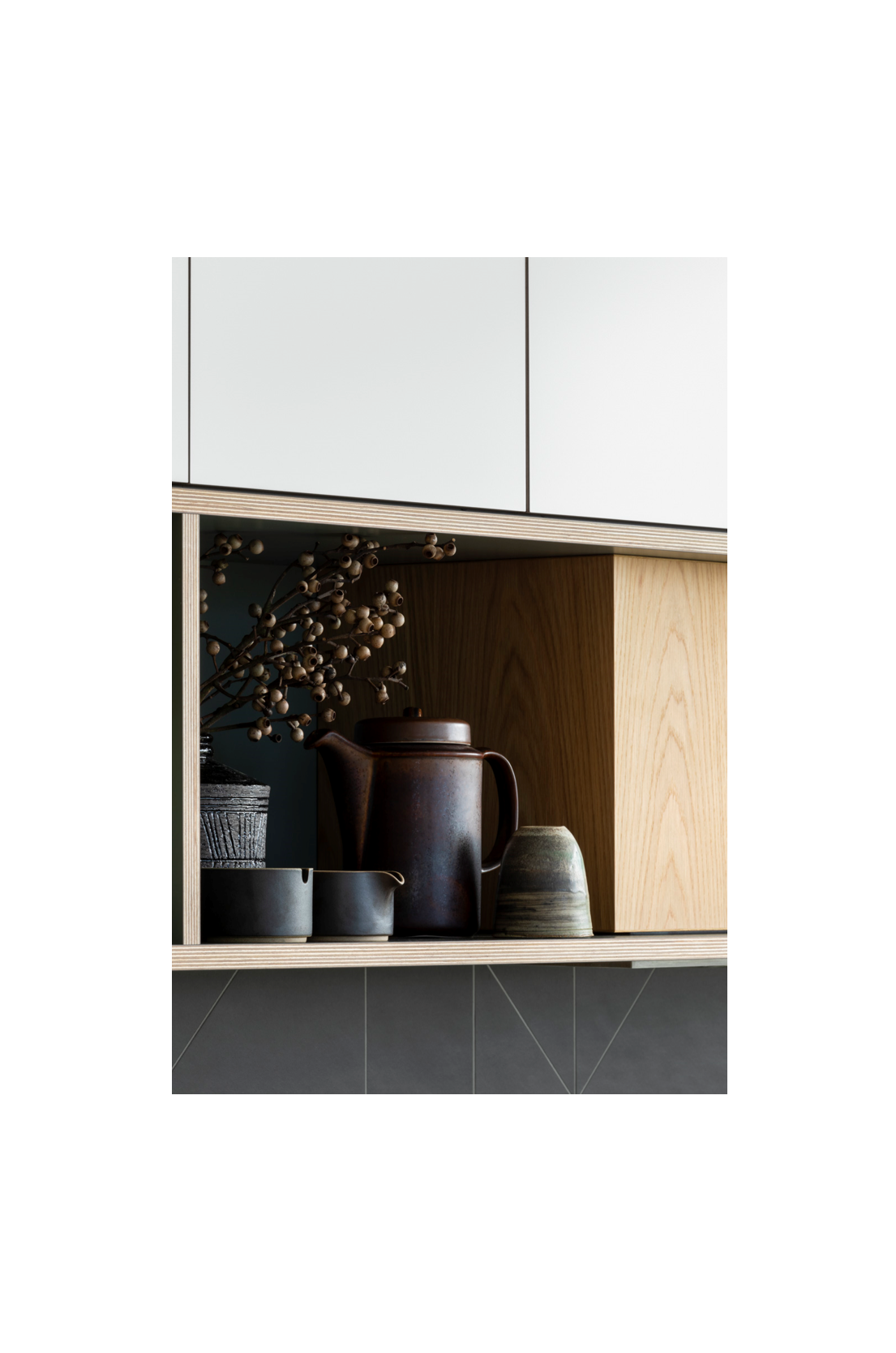
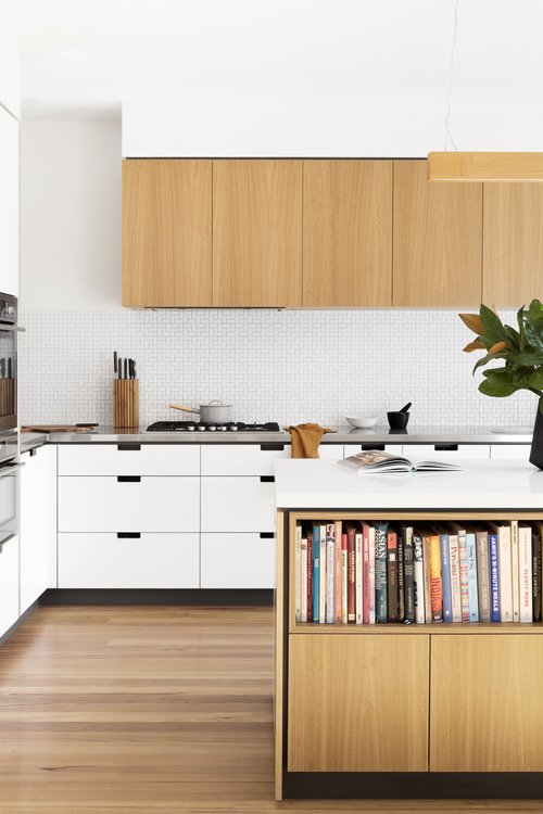
The clients of our Pascoe Vale Road project shared these values; both lovers of design, with a strong focus on longevity. Driven by this in their kitchen system choice, they felt the K3 Kitchen System was the perfect fit for their home, with its adaptable design and classic palette. K3’s signature white on ply fronts are accentuated by the milky Bianco splashback tiles, with contrast grout, texture and tone offset against the perimeter stainless benchtops. The terrazzo island benchtop repeats this depth of tone, offering a luxurious tactility. Jen, the owner was attracted to the K3 system, not only for its use of quality materials but also the open shelving, “I love the fact that I’ve got a beautiful set of integrated timber shelving which is great for displaying many different kinds of pieces”.
The versatility of the K3 Kitchen System is undeniable – it is equally at home in a contemporary or a traditional setting – but whichever the situation, it brings another dimension to the favourite room in the house. The combination of the clean materiality with the feature timber details for added warmth, gives flexibility in the design across various applications and briefs.
Jessi Eve, an Interior Stylist working on the Gold Coast, knew immediately the K3 System would work perfectly in her clients space, “I not only loved the seamless functionality of the kitchen and all the internal elements within the system, but also aesthetically, the detail in the design and finishes are just next level. The clever detailing of the cut-out pulls, the blackbutt open boxes and shelves…where the white laminate meets the ply bridges, and the gap between the all-white and the full timber top, it’s the perfect balance of practicality and beautiful, considered design”.
“I not only loved the seamless functionality of the kitchen and all the internal elements within the system, but also aesthetically, the detail in the design and finishes are just next level”
For maximum durability, the system features high quality laminate, adhered to durable FSC Birch ply, providing an easy to clean, robust surface. Coupled with the option of stone or custom stainless-steel benchtops. The K3 Kitchen System can also be paired with a selection of FSC / PEFC veneers with a Low VOC water-based finish to ensure even greater versatility.
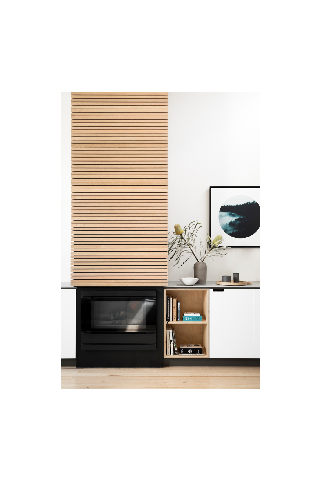
Another appealing feature of the K3 Kitchen System, is it’s ‘furniture feel’, giving the opportunity to extend the joinery to other rooms and providing a design continuum throughout the home. This was showcased in our Little Gold Street project, a warehouse conversion, where space was at a premium. Continuing the K3 joinery throughout the kitchen and living area, brought much needed voluminous light and a sense of cohesion. The design intent was to create a functional and aesthetic flow of dining, to kitchen, fireplace and living room, visually linking the three spaces, whilst maintaining thoroughfares. The design approach understates the value of an architecturally driven joinery response; enabling definition of living zones within as open plan context. Renee, the owner is delighted with the outcome, “we wanted a design that really connected the different spaces, this is now a space we can imagine ourselves in for years to come”.
“We wanted a design that really connected the different spaces, this is now a space we can imagine ourselves in for years to come”
Our Lygon Street project is also a great example of the K3 Systems ability to work within the whole home context and connect a space. In this case, the project was an apartment being renovated to cater to a family, with a strong focus on sustainability. The client, Vivian, also an architect, explained, “The kitchen was very much the starting point with the upstairs design, it initially felt a little like giving up some space, but I’m so glad we did. It works really well. The fact that you could combine it with other cabinetry throughout the house was very appealing”. Vivian had seen the K3 Kitchen on a previous client’s project and fell in love with the exposed ply edging, the focus on quality materials, and most importantly, the sustainable ethos that Cantilever is known for.
“The kitchen was very much the starting point with the upstairs design, it initially felt a little like giving up some space, but I’m so glad we did, it works really well”
Concepts of sustainable design, attention to materiality, and working with nature to create comfortable homes are not ground-breaking. In fact, they really should be common sense. When it comes to putting sustainable sensibilities into practice, Cantilever is design-focused and committed to making things that last. A project that really allowed us to explore these values and practices was our Creek Parade project, designed with and for Melbourne-based architect Vicki McLean. Creek House was Vicki’s version of downsizing her family home while maintaining a sense of flexibility and comfort. “Essentially a compact, well designed, well insulated small foot-print home is the best thing you can do for sustainability,” explains Vicki.
In order to make the most out of Creek House’s compact footprint, Vicki turned to local exemplars of mid-century architecture for inspiration. “The post-war period was a time of austerity,” she says. “There were restrictions on building sizes and materials were in short supply. An enthusiastic breed of young Melbourne architects found innovative ways of making small spaces feel bigger and more liveable.” Well-appointed joinery and built-in storage solutions are not merely an aesthetic fad of mid-century design, but a very practical means of achieving a sense of calm and order in small spaces. “There is lots of really useful storage space in Creek House. It needed to function well and it needed to look good. It also needed to be adaptable for all the different rooms. Cantilever were able to do all of that with the joinery at Creek House,” says Vicki.
“Essentially a compact, well designed, well insulated small foot-print home is the best thing you can do for sustainability”
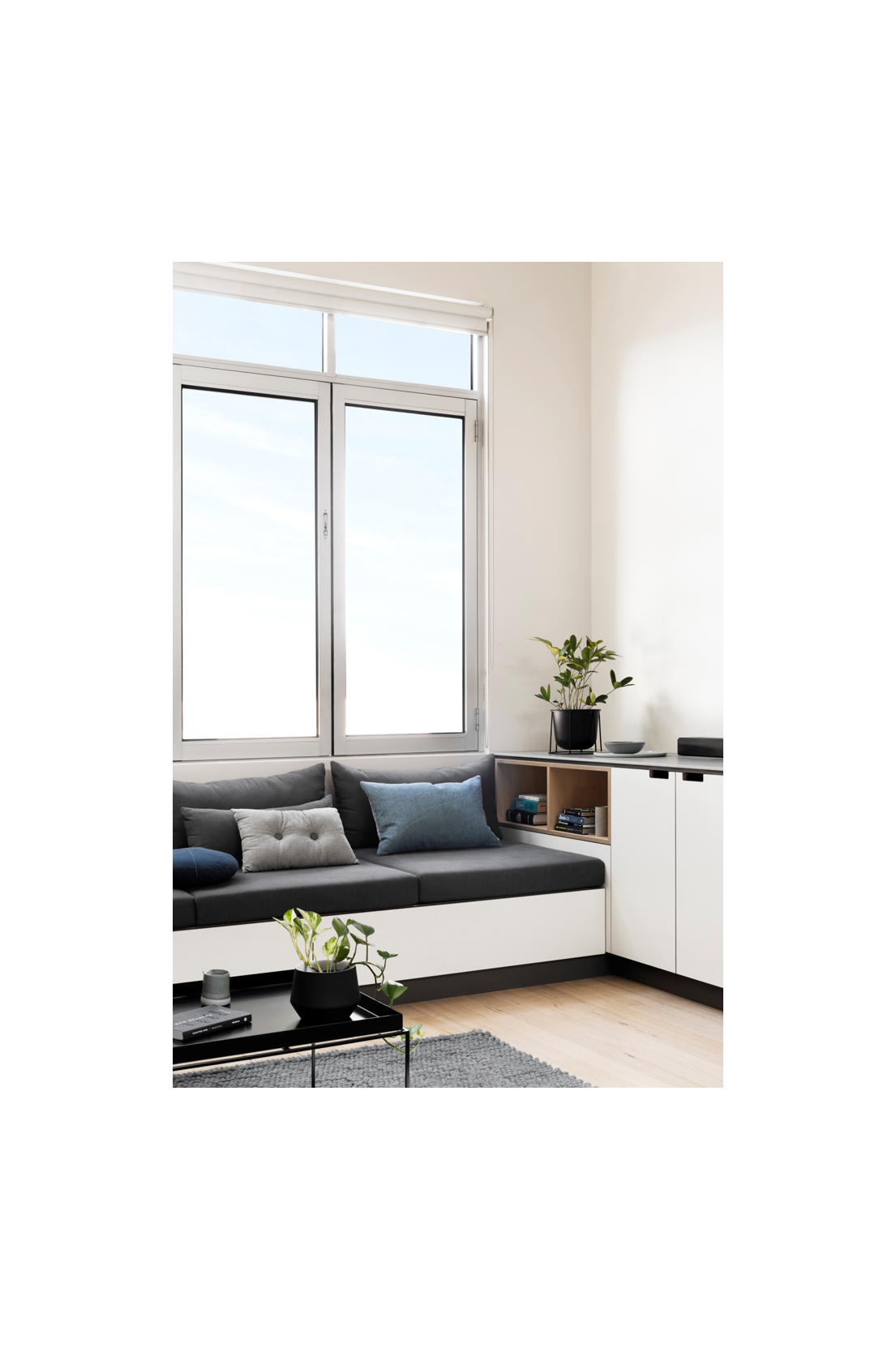
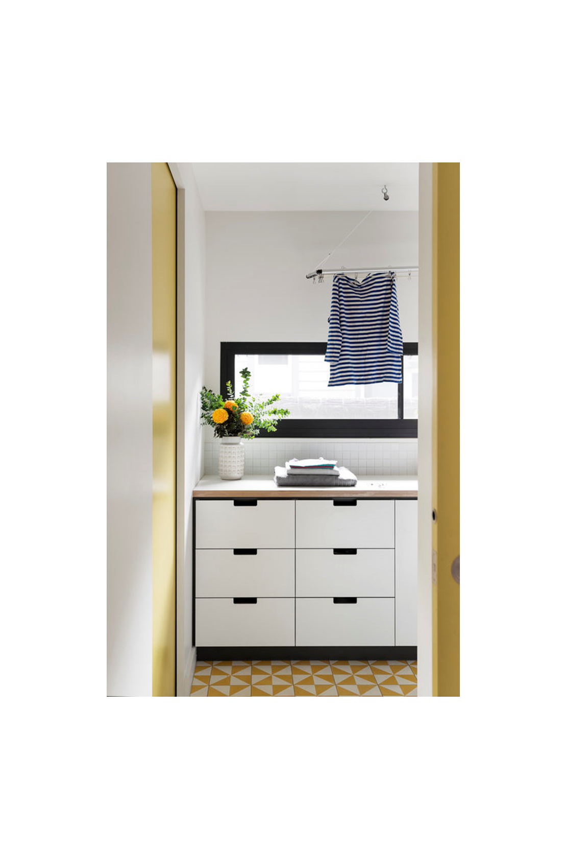
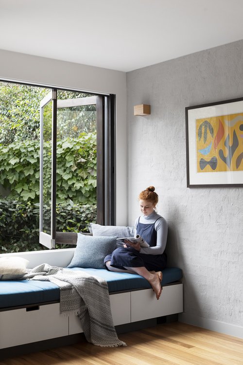
Here, our K3 System fitted the brief seamlessly, the timber veneer cabinetry accents and solid timber shelving introducing a warm, mid-century feel, paired with practical stone and stainless-steel benchtops. The cabinetry is finished with Cantilever’s signature K3 square cut-out and steel CH2 handles – small, robust details which add personality to the space. The laundry is also fitted with Cantilever cupboards, providing a streamlined link between the two rooms, other K3 furniture elements include storage and a lovely, cosy window seat.
Designing sustainable spaces around the concept of usability is a common thread throughout much of Cantilever’s work. Black and White House by Ben Callery Architecture was a 2015 addition to Cantilever’s portfolio that remains, to this day, a best-in-class example of holistic design in practice. It is a modern-Australian residence in the truest form, built upon the firm foundations Cantilever and Ben Callery Architecture’s shared values of sustainability and design integrity. “The good thing for me was knowing that Cantilever were doing the kitchen – in fact they were the starting point for the project,” says Ben, “we tried to reflect all of those values of Cantilever’s work in the house as well. Not only from an environmental point of view but also aesthetically, we designed our work to complement the materials and detailing of the Cantilever cabinetry.”
“The good thing for me was knowing that Cantilever were doing the kitchen – in fact they were the starting point for the project”
As an Australian manufacturer, Cantilever is well placed to supply product that is locally made and of the highest quality. With services such as kitchen concept design, design development and documentation, site service guide, manufacture, installation and interstate shipping, Cantilever is in charge and in control every step of the journey. The long term popularity of our K3 system is something we value highly, and we are committed to continue to nurture and evolve the system as one of our much loved staples.


