Design Horizon
Preferencing re-creation over replacement and designing with best outcome front of mind; has enabled Vivian and his family to transition to Apartment living, in this unique location, exchanging backyard for beautiful horizon.
Project
Lygon Street
System
K3 Kitchen System
Service
Kitchen, Living &
Interiors
Author
Kylie Forbes
Location
Melbourne
Images
Martina Gemmola
Written by
Kylie Forbes
Key Suppliers
Sussex Taps
Angelucci 20th Century
Lygon St Nursery Tiento Tiles
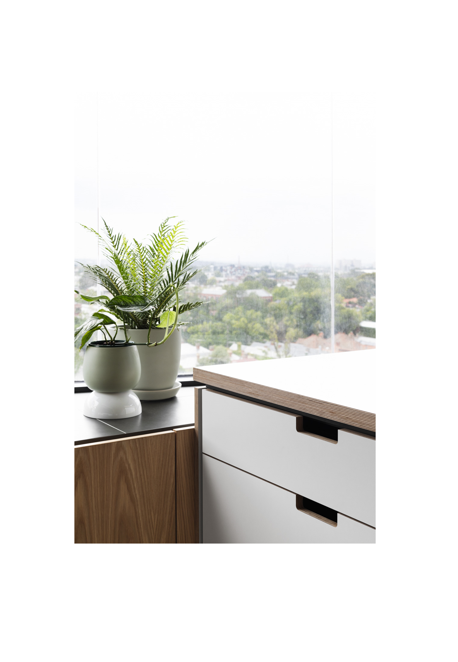
As you enter this Lygon St apartment from the long hallway, it is the light pouring in the windows that greets you and draws you further into the room. The windows span two walls, wrapping around a corner balcony, giving you an instant sense of openness. Once you are in the space, it is the view that captures your attention, stretching out as far as the eye can see, tree lined paths, leafy, neighbourhood streets and a sea of roof tops, all with a stunning city scape as the backdrop. There is a strong feeling of connection as you look out and watch the community buzzing below.
This bright, airy apartment is the pet project, and now family home of Vivian Faithfull, his wife Anna and their two daughters. Having previously worked as an architect, focused on high performance and sustainable housing, Vivian was very clear on what he wanted to achieve with this project. The family were challenging the status quo, moving from a traditional family home to an inner city, two level, three bedroom apartment. A total of 90m2 to cater to the many needs of family life.
The apartment Vivian and Anna selected is located in the vibrant, busy, suburb of East Brunswick. On the city fringe, this location has the huge benefit of being a stones throw from the Melbourne CBD, whilst also sitting right on the edge of the much loved Inner Circle bike path and lush green park lands that frame it. Located on the seventh floor, the apartment has uninterrupted city views, that will never be built in. It has proximity to good schools, public transport and excellent access to a variety of bike paths and parks, as Vivian confirmed, ‘its just in a really good spot’.
Many clients choose to replace versus recreate when tackling an apartment renovation. Not Vivian; who showed great design tenacity throughout this project, willing to figuratively push the boundaries of what this apartment could offer, prioritizing best outcome. His design of the project was tailored to maximise family togetherness, by prioritizing the communal space, and privileging the views, natural light and design investment in the areas shared by the family. The outcome involved a ‘flip’ of the existing apartment, moving the kitchen and living areas from the lower level to the upper level, to maximise the stunning light and views. The bedrooms were also relocated to the lower level to create a sense of escape and privacy when required.
“As a family apartment, I think you've got to think about, that there's usually only one living space, so bedrooms have to be much more than just that”
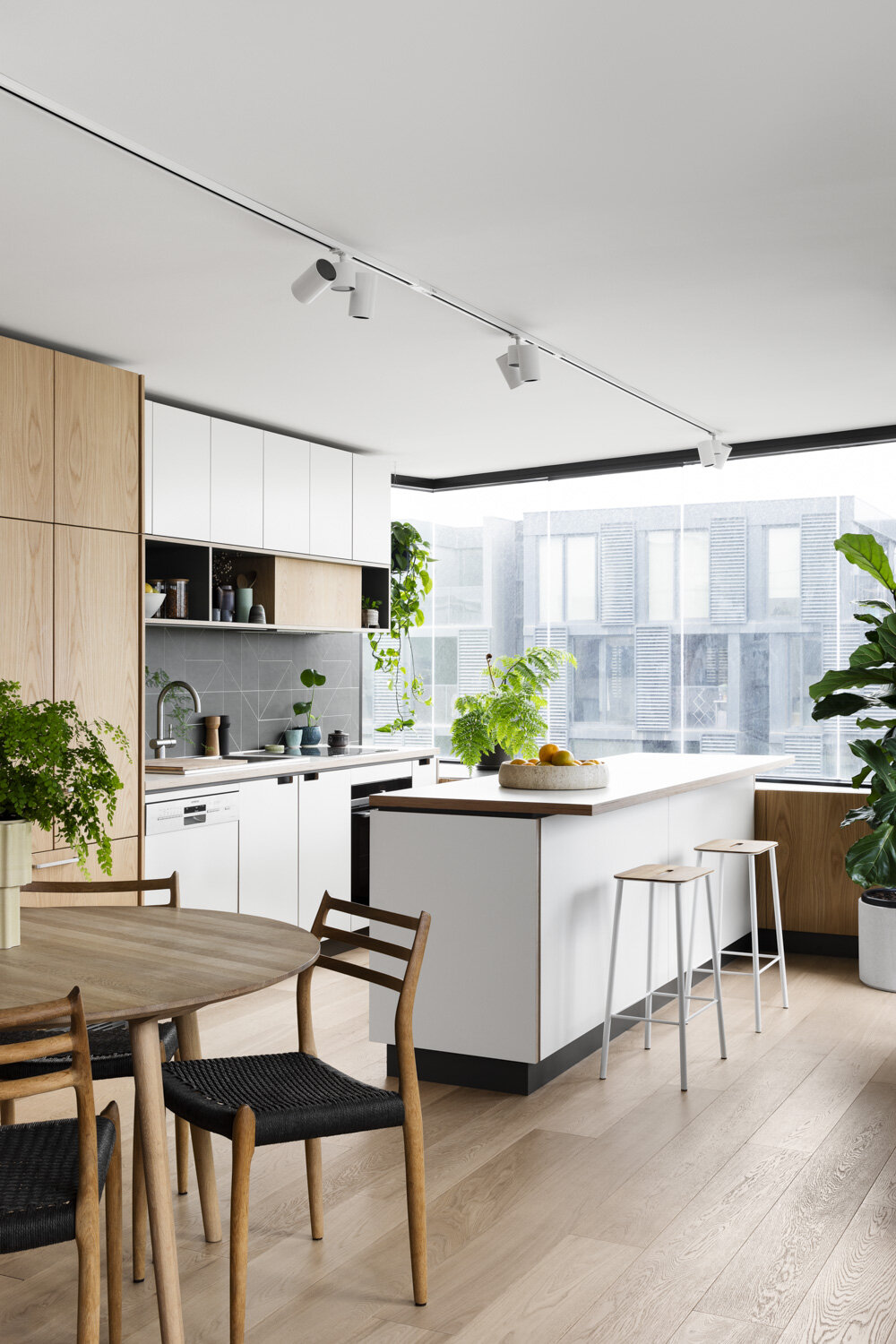
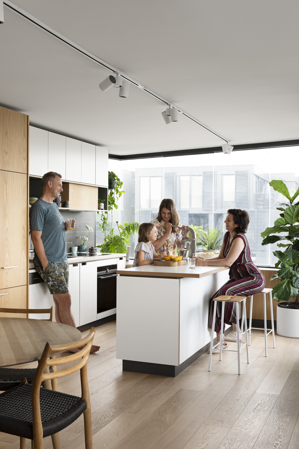
Within the living space, Vivian understood the importance of incorporating a kitchen design that both catered to the family needs but also enhanced and complimented the space. It needed to flow easily and naturally into the living zone to maintain the open plan ambiance. Vivian had long had his eye on a Cantilever kitchen and was excited to finally be in a position to have one in his own home. He had seen the K3 kitchen on a previous client’s project and fell in love with the exposed ply edging, the focus on quality materials, and most definitely the sustainable ethos that Cantilever is known for, ‘I saw it years ago and really liked it then, so it was actually a very long purchase’.
“The kitchen was very much the starting point with the upstairs design, it initially felt a little like giving up some space, but I'm so glad we did. It works really well. The fact that you could combine it with other cabinetry throughout the house was also very appealing”
Vivian and Anna engaged Cantilevers’ Interiors Service to assist in the selection of the colours and finishes. Anna really enjoyed the process and appreciated the guidance to avoid the common ‘overwhelm’ of decisions around colours and materials. ‘We sat with Cantilever for our design consult and in that time, they managed to immediately tap into our aesthetic, they read us really well, and knew what we liked and the outcome looks so great!’.
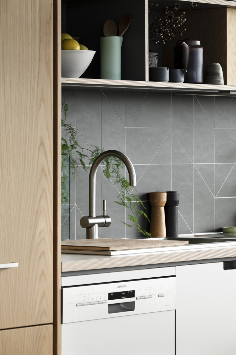
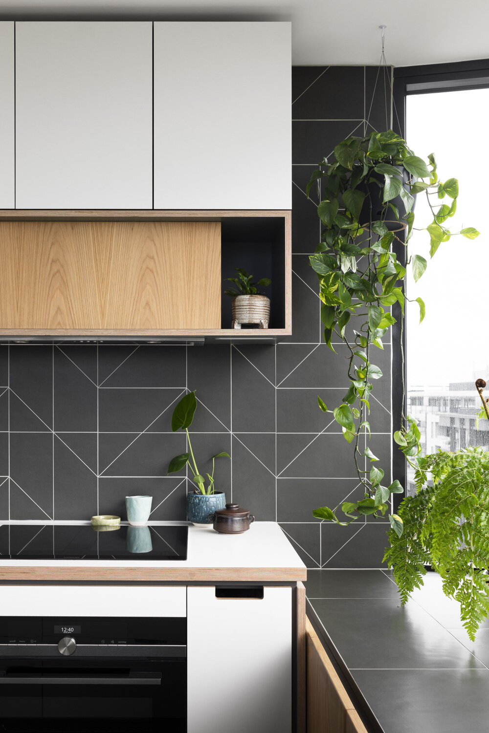
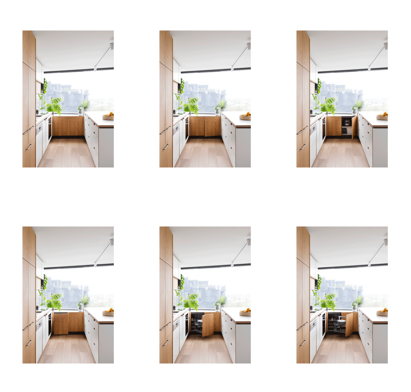
Introducing a dark green tiled splashback that continued onto the tiled window niche for plants, and underbench storage. This design detail is seemingly luxurious whilst deceivingly practical, making the space feel bigger than it is. A combination of White K3 Ply and a touch of Soft Green through the feature rangehood box is a favourite detail. The result is a restrained, calm space that feels relaxing and comfortable, allowing the outlook to remain the hero.
“We sat with Cantilever for our design consult and in that time, they managed to immediately tap into our aesthetic, they read us really well, and knew what we liked and the outcome looks so great!”
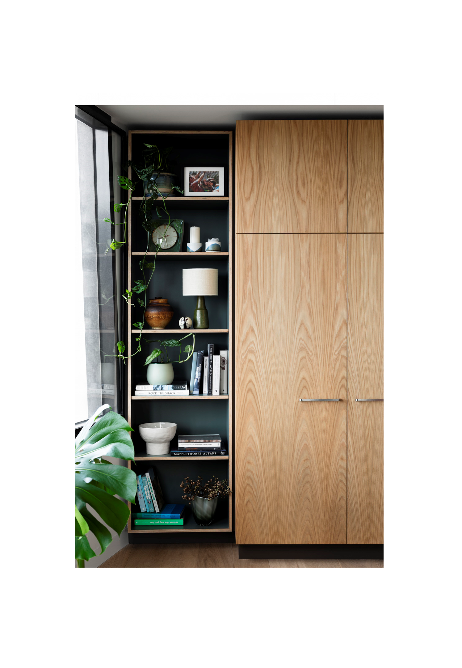
In order to enhance the flow of the kitchen and living space, Vivian and Anna chose integrated appliances, allowing the Kitchen to sit harmoniously in the dining space without visual compromise. The addition of an integrated Living unit design, which houses the television behind doors, and space for books and display, again conceals function and reduces visual clutter.
‘When it's a smaller space you need to plan it so well, so that everything's got somewhere to go. If you end up with clutter everywhere, and boxes piled in the hallway, it just mentally gets to you’.
Accepting that every space is multifunctional, as it is hard to zone small apartments, allows for a multidisciplinary approach to furniture and storage. Less is truly more in such a setting.
The same can’t be said of the scope of trade and additional building works required in such a renovation! Luckily for Vivian, he chose to work with an experienced builder who had worked with apartment spaces previously, Nexus Design Homes, a company we frequently manage projects with, headed up by Andre. We spoke to Andre about the specific nuances of Apartment Renovations, and the key considerations clients need to be aware of before embarking on their project.
The renovation took just over three months, by most architect’s standards this is a suitably, short timeframe. Andre’s recommendation to keep an apartment project on track is ‘notifying body corporate early in the process and getting a list of the requirements for your apartment complex, as these can vary greatly’. Andre also noted the importance of allocating additional time to all tasks, as everything is ‘a little more complicated’, differing service paths, work hour restrictions, difficulties in bringing materials in and out, depending on lift sizes, ‘even simple challenges like your trades not being able to park close to the building!’.
“When it's a smaller space you need to plan it so well, so that everything's got somewhere to go. If you end up with clutter everywhere, and boxes piled in the hallway, it just mentally gets to you”
As the renovation took place within the external walls of the apartment, there were no permits required. Andre noted that a benefit of apartment renovations is that ‘planning permit issues are less common in apartments as you are not meant to change the exterior’. He did point out however that ‘changing anything structural will require permission of body corporate, most likely an engineer, and possibly neighbours’ approval.’
Although Vivian’s project ran smoothly and kept to the proposed timeline, there were still a few unforeseen issues Vivian and Andre had to deal with. ‘Similar to an old house, you never quite know what you're dealing with until you've exposed it all. You think in an apartment, it would be more predictable, but it's not. You also can't structurally alter anything without a lot of paperwork. So, there are a lot of ‘work arounds’ required to come up with ways of getting a straightforward job done.’ Andre had a very similar outlook;
‘With a house there is nearly always a way around issues, with an apartment it’s not that easy.’
Andre pointed out another common challenge is getting accurate plans. ‘Access to plans for apartments is a common problem. Depending on the age of building, council may have plans, but it can take time to get them. Especially if the building is older and plans have been archived.’ Vivian faced this exact issue and was unable to get any accurate plans for his apartment. This was a huge challenge when trying to maximise the space when planning the bedroom spaces.
“With a house there is nearly always a way around issues, with an apartment it’s not that easy”
There was no better amplification of this fact than the ‘new normal’ of living with Covid! Completed in October 2020, the family saw 6 months of normality before Melbourne lockdown commenced, which tested the families’ capacity to live within the 90m2 apartment. Vivian highlighted the saving grace moments for each family member were different: Anna spent time on the balcony reading, Vivian enjoyed the connectivity to the bike path below and the horizon line, a vast feeling of space at the doorstep. The split-level design worked well to increase privacy for everyone, and a feeling of changing spaces, having ‘somewhere to go’. Everyone in the family has a separate room, which meant that time could be spent together, and apart, although the storage and functional demands of the bedrooms became increasingly important.
‘I realized that more thinking was needed in the designs of the bedrooms, we needed to consider both desks and storage spaces. Something we are now looking to do’.
Having now lived in the apartment for 18 months Vivian can reflect on some learnings from the experience. The family renovated prior to moving in, which meant that there were things about the property that they didn’t know, like how cold it would be living in the sky!
Orientation has direct influence over the temperature of every home, and it is difficult to get it perfect. Andre also pointed out that ‘apartments rely heavily on air conditioning and heating for temperature control, so you really need to get it right’. In this apartment, the primary windows are east and south facing, which creates lovely cool summers, but even cooler winters. Vivian reflects that had he realized, he would have invested more into the insulation work completed during the renovation.
‘When it comes to meeting building codes, apartment blocks are assessed as a total volume, the accumulative effect of the various apartments and communal spaces together. This can impact negatively on an individual apartments’ thermal performance’.
The overwhelming message from both Vivian and Andre is that when tackling an apartment renovation, meticulous planning and project management are crucial, but also a flexible mindset to overcome unforeseen issues. Creating an apartment that doubles as your family home has allowed Vivian and Anna to enjoy the best of both worlds, successfully creating a comfortable, family home, through clever and considered use of a small space. The layout and design work cohesively to ensure the outlook remains the hero, ‘the view is super important, and we don't ever get over it’.
Instead of spending their weekends doing home maintenance projects or mowing lawns, they now have everything at their doorstep to enjoy, the time to do it, and an inviting space to retreat to afterwards.


