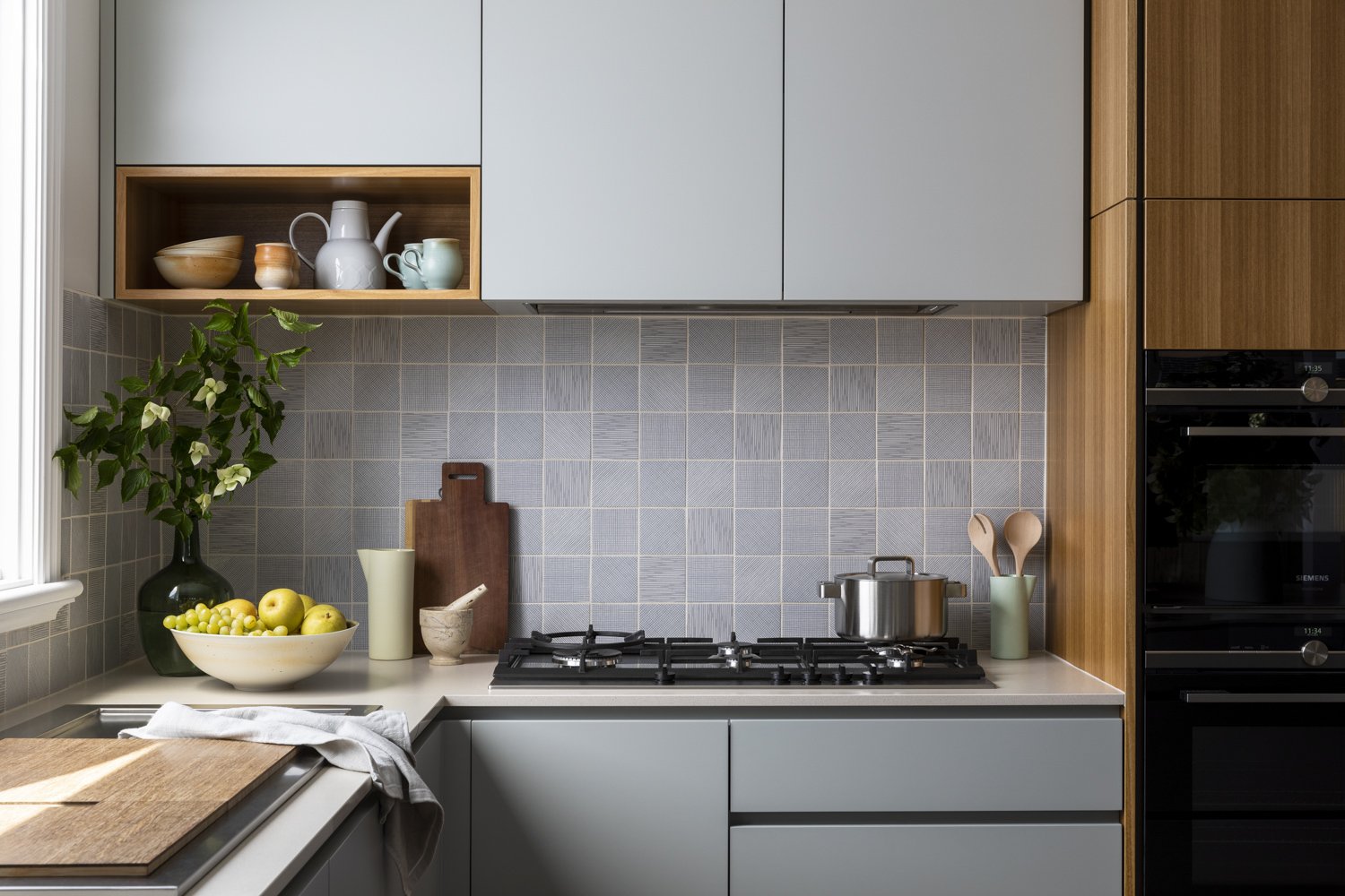
After 36 years in a beloved family home in Pascoe Vale South, a pair of empty-nesters briefly considered flying the coup. They landed instead on a transformational refresh, reconfiguring downstairs spaces, improving thermal efficiency, and reinstating flow for themselves and their close-knit, intergenerational family.
Read MoreThe client-centered design journey of a Cantilever project gives time to exploration, listening, and response. What began with a sociable island bench evolved into an interior refresh of a city apartment whose expansive views invited the kind of bold detailing and unifying materiality that adds depth and intimacy to open-plan living.
Read MoreCantilever’s Interior Service helped exhausted clients get their project back on track with deft, unifying elements that harmonised a disjointed interior. The outcome is a relaxed, light filled family home brimming with colour and sociable spaces for togetherness and the day-to-day rituals that bring them joy.
Read MoreThe city dwelling of a freshly retired couple; who are now kindling their love of rural rolling plains and fruit trees during the week, prefaced the project as ‘the weekender’ to enjoy friends, family and our city’s bounty.
Read MoreThis beautiful Cape Schanck home is poised above the escarpment of Gunnamatta Beach, with sweeping views along the farm and coast line, punctuated by the floating distant CBD appearing to hover on the horizon sky. Settled into the surrounds by native tea tree, striking against the dynamic light of the everchanging sky, the beauty of the location became a muse for the project.
Read MoreEach room in your home has its own purpose and atmosphere, yet a harmonious home considers how they feel collectively. Mark and Lyn, the owners of this South Yarra apartment, have achieved this harmony, through restrained use of colour, tactile finishes, a Japanese style influence, and a preference for Australian materials and craftmanship.
Read MoreThis spacious, architecturally designed apartment was brimming with potential, located in the inner-Melbourne neighbourhood of Carlton, with the city, restaurants and of course, excellent coffee at its doorstep. All the apartment needed was a new owner to bring the space to life. That’s where Lucy came into the picture.
Read MoreMatt and Peter didn’t expect to settle into the northern suburb of Coburg, nor did they expect to grow so fond of it. However, it was their search for the ultimate ‘renovators delight’, liveable but with plenty of future potential and of course, a nice size backyard for Frankie, the French bulldog, that led them to this eclectic, vibrant, community that they now love and feel a strong bond to.
Read MorePersonality, colour and functionality were key reference points for this clever, within footprint, renovation. The result is a vibrant, considered and comfortable home, designed to effortlessly adapt to family life and entertaining. Our clients, Melissa and Johnny, couldn’t be happier with the outcome.
Read MoreThis warm, family home brings a softness in palette and materiality, creating an inviting home equipped to partake in the rituals of daily life. Working within the existing footprint of the home, this relatively small renovation has made a big impact, revitalising the interior, encouraging a free flow of movement and creating a home equipped to handle the ongoing demands of family life now and into the future.
Read MoreConsidered, open and light filled, Cynthia and Stephen’s renovation is brought to life with a thoughtful mix of colour and texture. The couple and their young son, Lenny are now enjoying living in the home they created. Designed by Cynthia’s architect father, Seng Leong, the project was close to their hearts and a tribute to his memory.
Read MoreSpace can be found in even the tiniest of townhouses, if only one makes use of built in joinery – the renovation of this Little Gold Street warehouse conversion is a case in point.
Read MoreAkin to the concept of design beyond trends, our brand history in furniture design has influenced our desire and belief in design for longevity, of the value of a design classic, and its possibility. David and Anouk’s project epitomises this idea, spirited by Anouk’s own European heritage, and appreciation of design legacy.
Read MorePreferencing re-creation over replacement and designing with best outcome front of mind; has enabled Vivian and his family to transition to Apartment living, in this unique location, exchanging backyard for beautiful horizon.
Read MoreThe play of light is the expression of Architect Vieri Nembrini in this personal project. K2 Kitchen palette is explored, connecting to heritage materials, in a sense, reminiscing through design. This new build project shares a robust palette, characterized by the logical expression of the building’s construction methodology.
Read MoreIntroducing our K3 Kitchen System in SoftTouch Black. Claudia and Juliet are the happy first owners of the new edition to Cantilevers’ product family, and we recently caught up to talk about their renovation journey, and how the experience of their new home, and Covid Lockdown has changed their lives.
Read MoreStep Inside a multi-generational family home, once an old Bottling Dairy, now a cluster of studios for artist Martin Tighe, and partner Jennifer, and a true story of Design for Longevity.
Read More


