‘Son et Lumière’ / Play of Light
The play of light is the expression of Architect Vieri Nembrini in this personal project. K2 Kitchen palette is explored, connecting to heritage materials, in a sense, reminiscing through design. This new build project shares a robust palette, characterized by the logical expression of the building’s construction methodology.
Project
Gold Street
System
K2 Kitchen System
Service
Full Service
Interiors
Author
Kylie Forbes
‘Son et Lumière’ / Play of Light
Our home is a very personal expression for many of us, for an architect it is both the ultimate showcase of their skills and passion, as well as an opportunity to truly enjoy the fruits of their labour. Gold Street was the personal project of Vieri Nembrini, an associate director at H2O Architects.
Vieri and his wife Francesca, have a strong passion for travel, regularly visiting their home country of Italy. They enjoyed many years of travel back and forth with Francesca’s business of co-ordinating wedding adventures in Europe. As the family began to grow, now with two teenage sons, the time had come to settle into a more permanent home, it was Brunswick that captured their hearts. A true gem of the north, Brunswick is bustling, artistic and lively, with a strong community feel and European connection.
The Nembrini family selected their site with plans for a new build to enable Vieri to create an idyllic family home. The family lived in the original house on the site for a few years whilst they worked through the design and planning stages of the project. This enabled Vieri get a great sense of the site’s orientation and light aspects.
The orientation of the block suited a compact build, with a wide north facing backyard. Designing with passive heating and cooling practices front of mind, the narrow, tall building takes advantage of light and cross flow ventilation at every angle. The outcome, of a well-considered and greatly detailed design process, is an ample double story yet narrow house, that successfully pulls the light into the south side of the home. Wrapping landscaped gardens flank the building on three sides, creating viewpoints from each window. Throughout the house the rooms are not squares, neither the ceiling, giving the home a playful ambiance.
Upstairs consists of three comfortable bedrooms and two bathrooms. Downstairs is open plan, airy and bright, with the kitchen and dining creating a central gathering place to bring family and friends together, giving the home a warm, inviting feel. The study, now a staple in any new build, sits just off the kitchen, adjacent to this is the living space, complete with a cosy fireplace.
On the opposite side of the house, the design cohesively accommodates the entrance, a thoroughfare, and the stairwell, where the laundry come, powder room tucks nicely underneath. The South East corner of the home, is a second living zone, providing the family with a quiet escape option when needed.
The north facing backyard captures the warmth in the aggregate concrete floor, the sunlight highlighting its beauty while also providing thermal mass to warm the primary family space. ‘We love the big windows, which bring in all the noises and smells of the garden outside so we can enjoy a beautiful day in an indoor space.’ Vieri The design caters to daily family life in a really relaxed, accommodating way. It is definitely a place you want to spend your time in.
“We love the big windows, which bring in all the noises and smells of the garden outside so we can enjoy a beautiful day in an indoor space” Vieri
–
There are many factors to consider when building a new home and designing a beautiful, yet practical joinery is of vital importance to family life.
The open plan layout of Kitchen, Dining and Study was preferred by the family;
“It’s a refuel station for Pietro and Giacomo, and Francesca and I both like to cook, so we prepare our meals and enjoy the cooking without being separated from the rest of the house,’ says Vieri. ‘It’s good to be in the same open space together’.
Vieri and Francesca, recognised the need for expert advice and guidance to ensure both continuity and functionality and engaged Cantilever. At Cantilever, our design process focuses on the way you use your kitchen, how you prepare food and socialise in the space. Through our Interiors Service, we work closely with you to select a palette combination of material, colour and texture to compliment and accentuate the overall design aesthetic of your home.
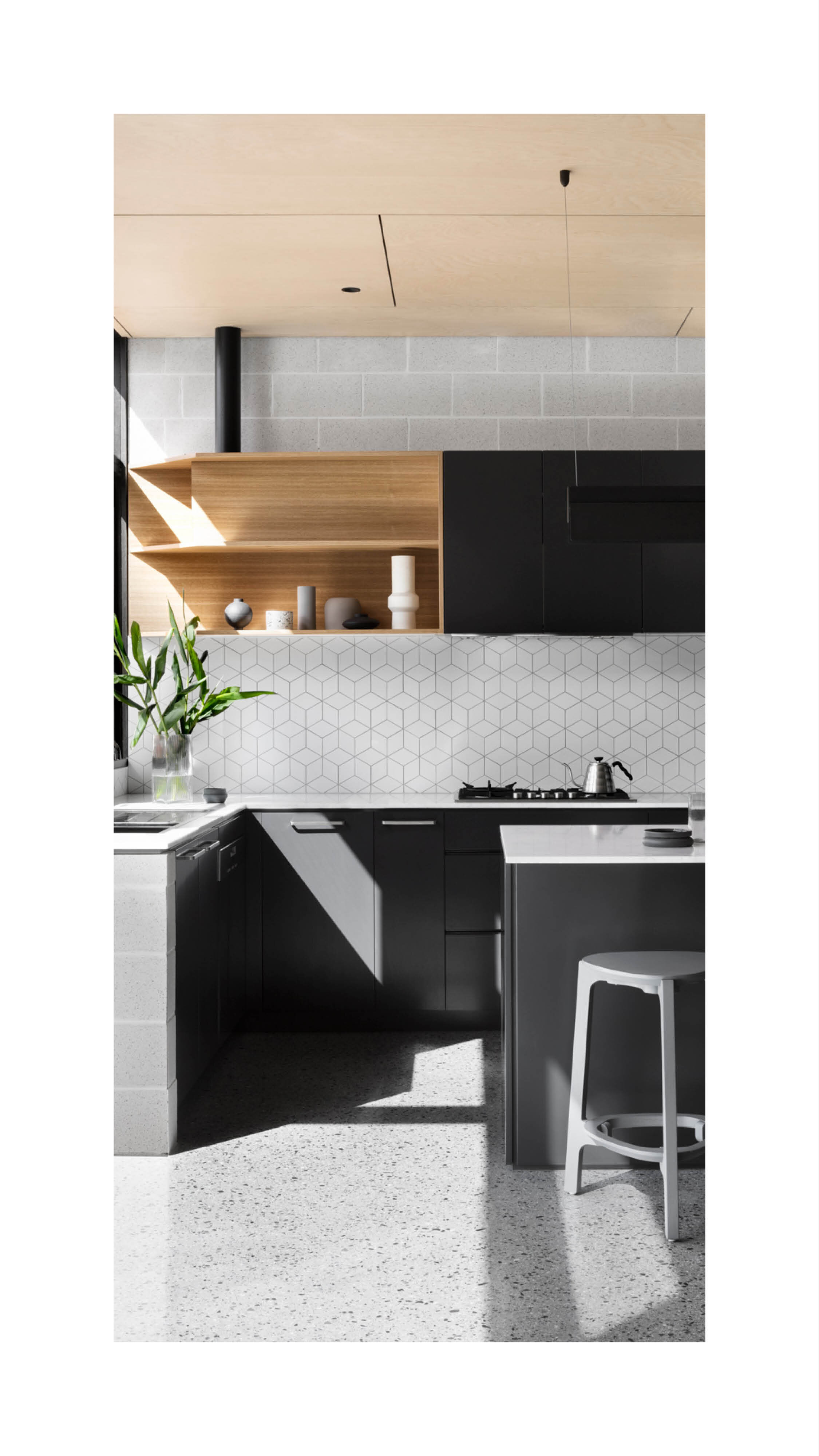
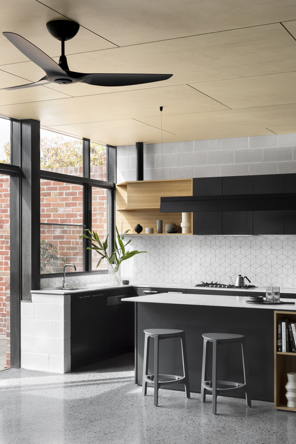
By iterating the architectural design of the home, Vieri brought a resolved concept to us to compliment through the joinery finishes. Reminiscent of H2o Architectural’s approach, the project is characterised by the logical expression of the building’s construction methodology, in this instance grey Besa Brick, Ply lined ceiling, concrete aggregate floors and black aluminium double glazed windows; engaging a textured, honest aesthetic. The combination, aligned with the floorplan, elevates the play of light throughout the house, articulating the theme of Chiascurro.
.
“Materiality works to connect and prompt a feeling within a space, triggering an emotional attachment or reaction. It’s often our life experiences that influences those connections, linking a past event or memory into those emotions. This instinctively draws us to a particular texture or material, based on a feeling of familiarity. Tapping into this, is a wonderful way of incorporating a sense of belonging within a new space.” Kylie
Harking back to their Italian heritage, Vieri and Francesca drew inspiration from timeless marble;
“The grey vein marble benchtop is a favourite. That marble came from Italy, where marble is everywhere. It gets better as it gets older.” Vieri
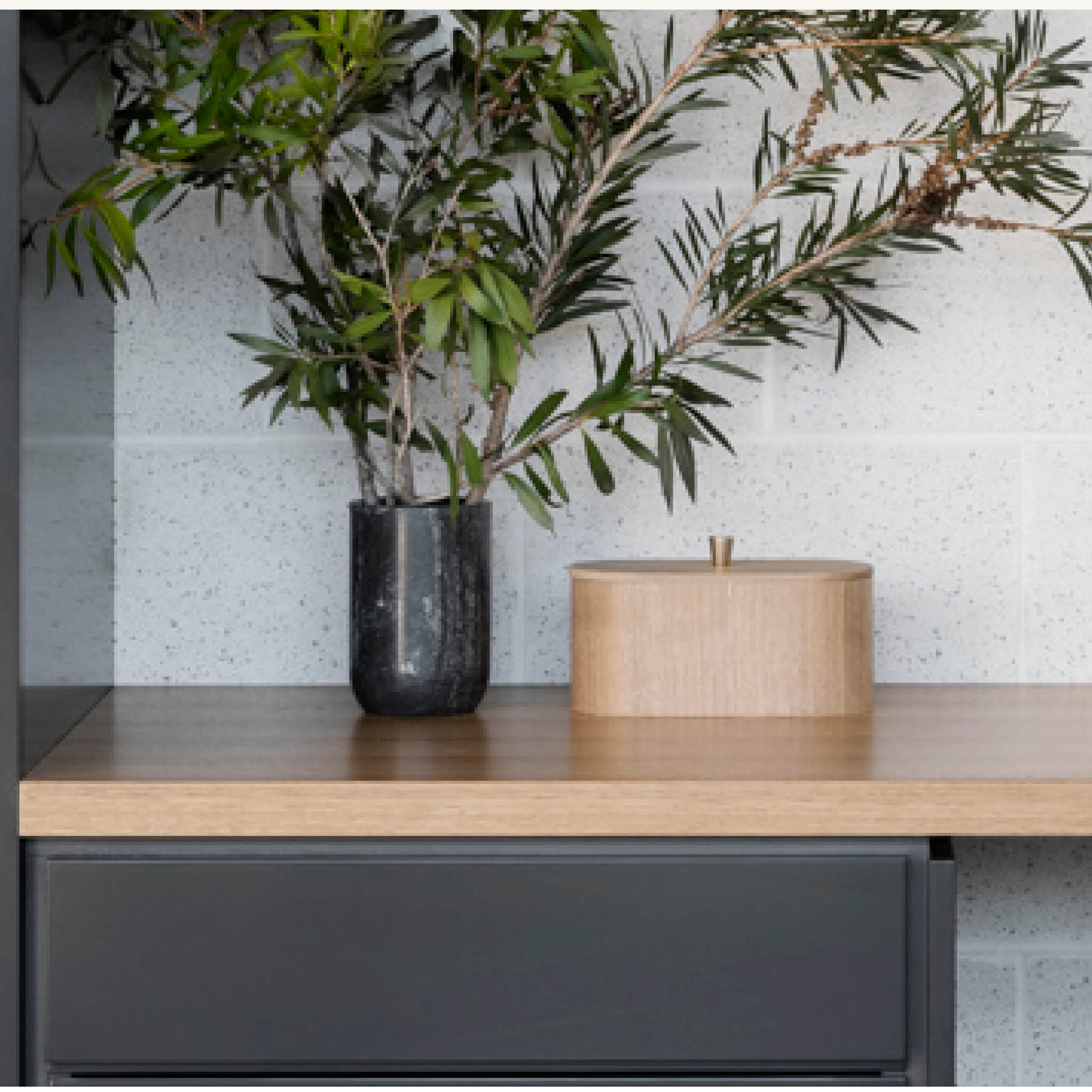
The theme of Chiascurro, or the play of light and shadow, is expressed through the palette of the Kitchen’s black cabinetry, marble, and diamond tile splashback. The need for nuanced colour options - to pair cabinetry colour with the natural stone with veneer, led Francesca and Vieri to select the K2 system.
The material composition of K2 is stone, veneer and two pack paint, which can be selected in any colour. It is this flexibility of colour palette, paired with the refined detailing that makes K2 an extremely popular choice, particularly for architectural projects where a scheme needs to be expressed throughout the joinery.
“The grey vein marble benchtop is a favourite. That marble came from Italy, where marble is everywhere. It gets better as it gets older.” Vieri
–
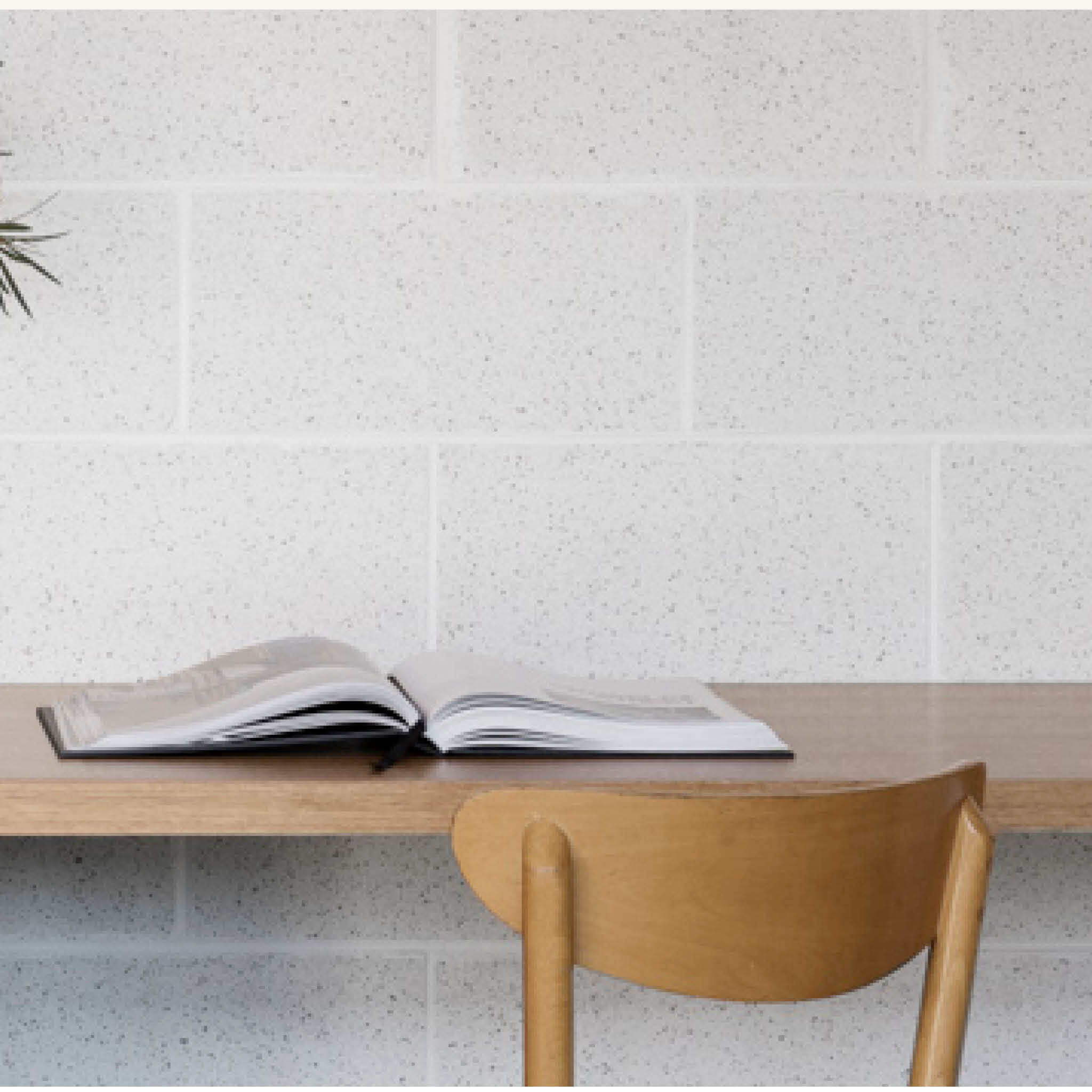
After consultation and consideration, the final colour selection for the cabinetry was Domino, a neutral, graphite black with a grey blue tone, giving the joinery a softer presence. This colour complimented the tones of the stone and the besa brick featured throughout the house. This dark yet calming shade, really emphasised the beauty of the K2 System and complimented Vieri’s overall design aesthetic. Warm grey besa bricks bring texture, contrasting with the smooth sheer of Carrara marble benchtops. The accents of the American Oak veneer timber, pick up warm tones of the red brick walls, and ceiling, without matching either. The bone matte finish of the tessellated tiled splashback reminded Francesca and Vieri of Italy circa 1950’s – offering an unassuming daily reminiscence.
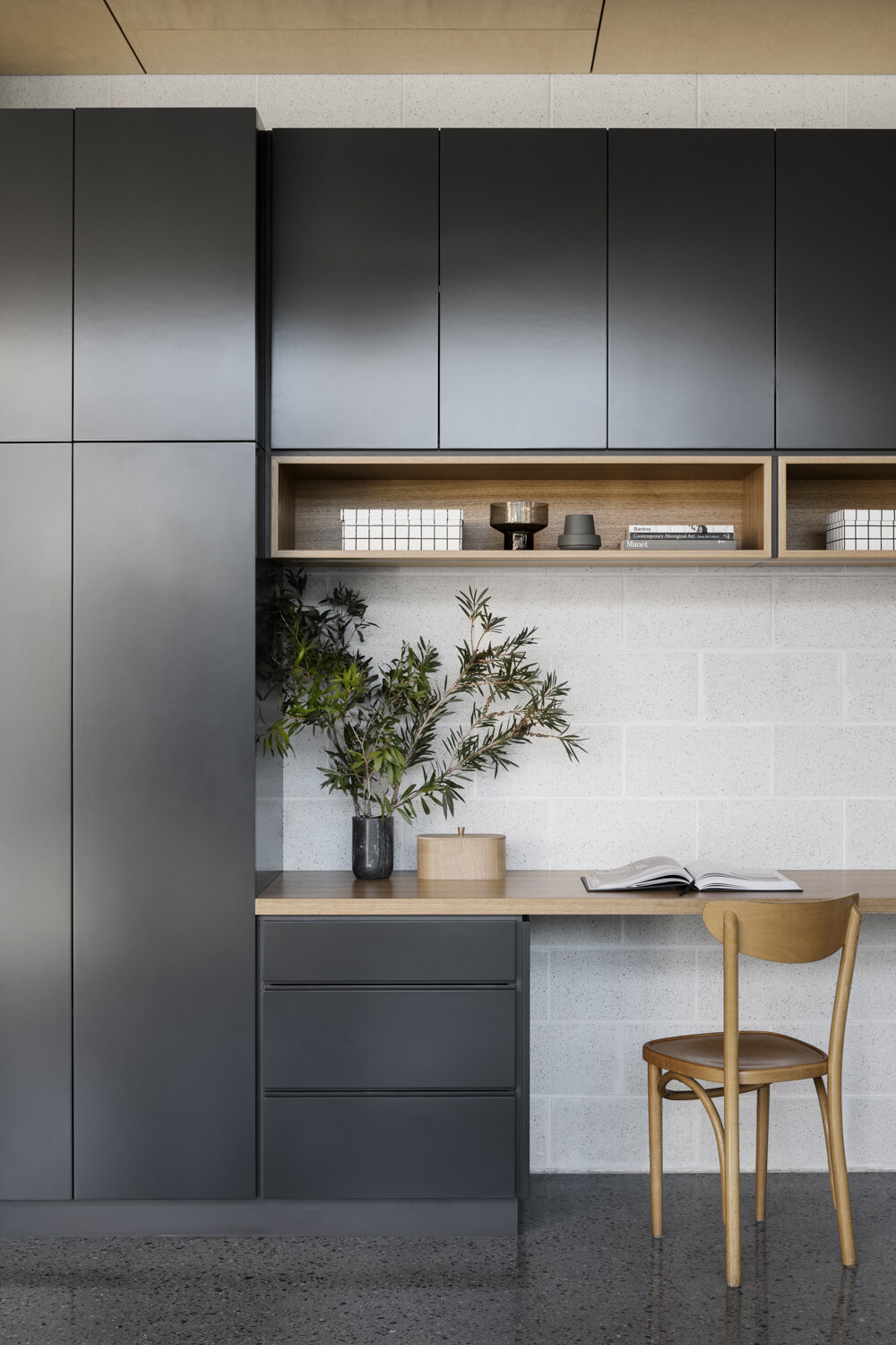
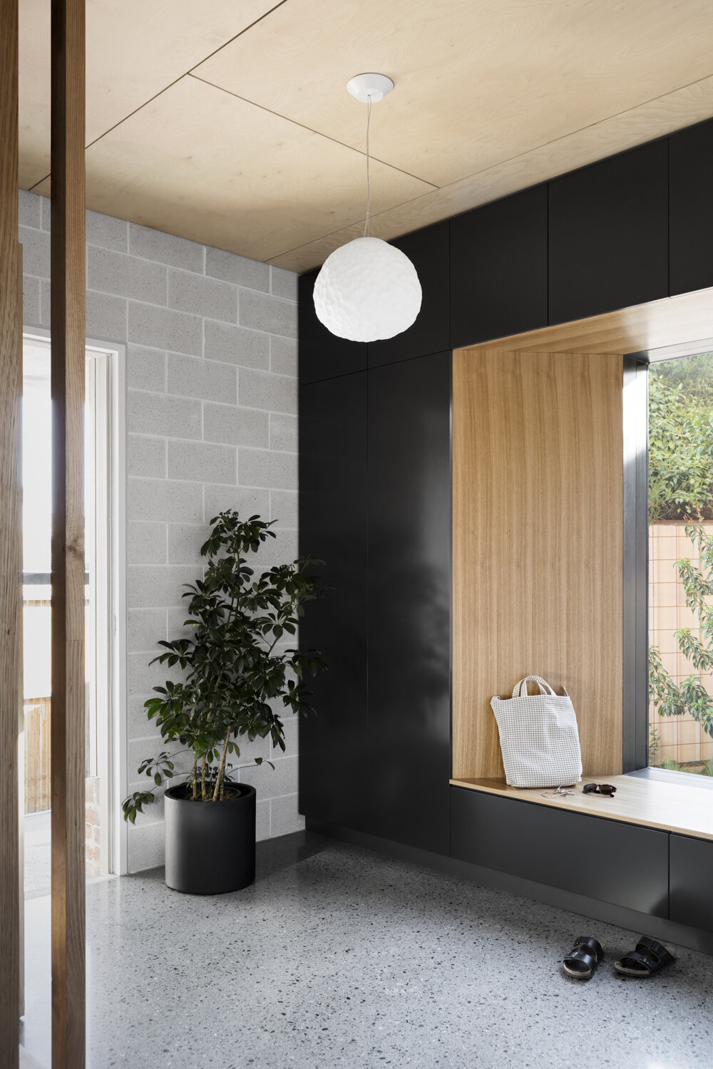
To achieve continuity of design, custom Cantilever entrance joinery was installed, with custom detailing for the window ‘frame’, also featuring the K2 palette as showcased in the kitchen and study. The frame required some unique thinking and treatment, to allow each intersection to come together. The study, adjacent to the kitchen also utilised the K2 system, the use of the consistent palette, is a lovely way of visually connecting this space to the main living area of the home, whilst also offering more practical solutions;
“The benefit of having a study near the kitchen is that it keeps the island benchtop in the kitchen uncluttered!” Vieri
Vieri was keen to see overarching architectural elements remain true to the project and relied on Cantilever’s detailing expertise to get them right. In this case, this involved weaving heritage into a bold, crisp aesthetic.
The final result is a home that feels calm and centred, it is a well-considered, contemporary balanced aesthetic. This design is a wonderful achievement and endorsement of Vieri’s talents. It is incredibly functional, visually impressive and most importantly, a place that his family love to be in and share.


