Spatial Relations
Space can be found in even the tiniest of townhouses, if only one makes use of built in joinery – the renovation of this Little Gold Street warehouse conversion is a case in point. Making clever use of joinery to bring voluminous light and space into this townhouse in Brunswick, Melbourne.
Project
Little Gold Street
System
K3 Kitchen System
Service
Joinery Design and Manufacture
Author
Kylie Forbes
Location
Melbourne
Images
Martina Gemmola
Styling
Ruth Welsby
Written by
Kylie Forbes
Key Suppliers
Sussex Taps
Miele
V-ZUG
Urban Edge Ceramics
The Little Gold Street Project was once a part of a warehouse conversion in Brunswick in 2004, originally a brick factory, it now includes 4 residences. The conversion was done by McCorkell Design, with the aim of targeting small scale inner city living. Each townhouse consists of a stacked three-story layout, with ground floor garages and rooftop deck. The benefits of this style of living, are obviously the sought-after location, but also the sky drenched decks with city views.
In time, the townhouse was bought by our clients, who were keen to revitalise the floorplan and quality of finish throughout the home. After careful consideration, they approached Cantilever to assist with the renovation of the townhouse. A design conscious couple who cared about quality and appreciated the integrity of the investment they were making in their home; the brief was to work within the existing footprint, with sensitivity to the architectural intent.
“We wanted a design that really connected the different spaces”
Renee, Owner
The existing home layout was typical of a townhouse, a long narrow floorplan with light entering from either end. This limited light available for the central hub of the space, with windows only on the street facing end, and side back corner of the building. Therefore, the need to keep the space feeling as light and airy as possible was prevalent. Cantilever designed a joinery response for the space which increased natural light exposure, while also increasing the storage and enhancing the function of Little Gold Street’s living, dining, and kitchen spaces.
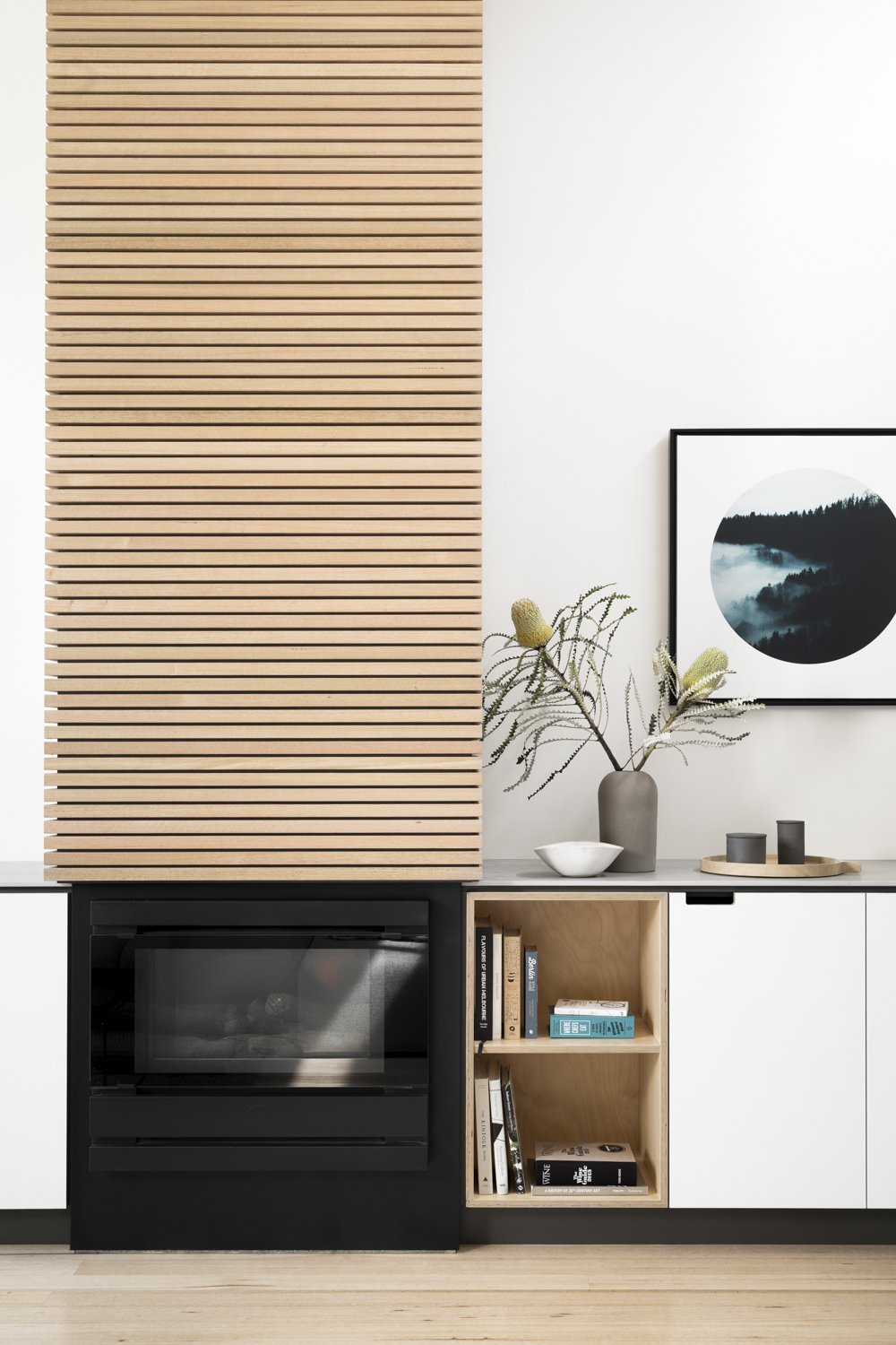
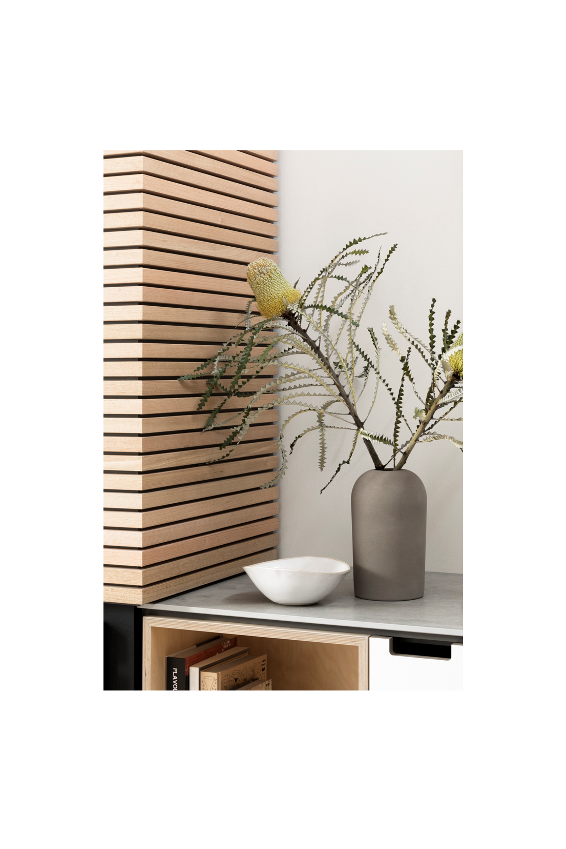
The couple chose high quality finishes, with a simple aesthetic to tie back the architectural palette with the joinery, this cohesion and simplicity provides a sense of calm and openness to the space. Choosing our K3 Kitchen System, with accent hoop pine ply open mitred boxes, worked well to unite the lime ply boards with solid Tasmanian oak stairwell battens, through the exposed ply edge detail signature of this system. The white cabinetry, with light grey stone benchtops now bounces soft light through the space, elevating the ambience of the room. The contrast of the benchtops against the floorboards emphasizes the simplicity of the design. Tasmanian oak battens were introduced to the fireplace, repeating the detailing used on the stairwell, balancing the spatial aesthetic. The K3 system has a softness and paired back design, allowing it to seamlessly move from kitchen to living space.
“Our kitchen designs are furniture-inspired, so the look can bleed into other areas really comfortably”
Travis, Cantilever Interiors
The design intent was to create functional and aesthetic flow of dining, to kitchen, fireplace and living room, visually linking the three spaces, whilst maintaining thoroughfares. This design approach understates the value of an architecturally driven joinery response; enabling definition of living zones within an open plan context. A key flaw of the original floorplan was a central tall pantry and Island unit that ran parallel to the stairwell, encased in nib plaster walls and creating a hallway; cutting the floorplan in two. Blocking the light coming from the south east corner window, the kitchen workspace was overshadowed. The swift decision was made to remove the height of this element in the design, re-instating sight lines and flow of light, throughout the kitchen space.
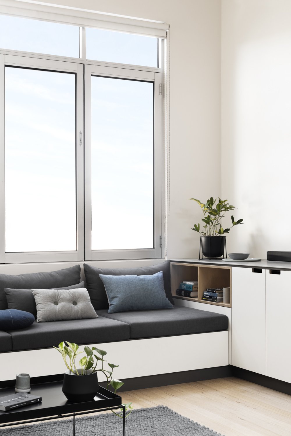
Entering the level from the ground floor stairs, you step into the Dining Zone, which is detailed with an open mitred box, for display. You naturally turn to face the Kitchen, casting over the 3.8m island bench, highlighting the living zone beyond with unimpeded views, accentuating the depth of space. A feature vertical open mitred box softens the expanse of this run, offering a transition point between kitchen and dining zones. This feeling of expansion is heightened when walking past the island, which finishes just as the height of the ceiling opens, to reveal the full height of the living space. This moment is accentuated by the fireplace’ solid Tasmanian oak detailing, creating a column that reaches the ceiling height. The battens used in the fireplace materially connect the existing stairwell detailing, sympathetic to the architectural intent of the original design, and working to ‘conceal’ the renovation. Custom banquette seating wraps the Living Room, finishing the transformation. 15 lineal metres of continuous joinery in all.
“Taking the tall joinery in the kitchen to the perimeter, and ceiling, helped integrate it with the home’s existing architecture and improved light”
Travis, Cantilever Interiors
In a design such as Little Gold Street, maintaining an elegant flow through the joinery was important, and integrating the fridge and dishwasher helped this effect. Appropriate appliance selection is key to creating a practical, yet appealing and open kitchen design. There are many integrated appliances available, with options to adapt and work within small spaces and the restrictions that come with either townhouses or apartments. A great example of how appliances influence design outcomes was the use of the Miele downdraft cooktop. Sitting within the island bench, the downdraft cooktop integrates the ventilation system directly into the cooking surface, eliminating the need for an overhead vent. Removing the need to install a canopy rangehood and overhead cabinetry, allowed the space to remain open and uncluttered above bench height.
“Using downdraft rangehoods really gives you a lot more above-bench freedom and eliminates the need to accommodate exhaust systems, which for this project meant we could clean up the ceiling, which was important.”
Travis, Cantilever
The three key areas of investment required to realise this project were joinery, appliances + fittings, and build works. The simplicity of build works required to execute this transformation of the home was a benefit. Reworking the ceiling, improving lighting, refinishing floors, painting and trade work relative to kitchen installation (such as plumbing and electrical) are the common elements involved in a refurbishment project. Moving services in an existing townhouse is never straight forward, especially when negotiating bulkheads, but relative to major structural changes in a property; worth the expense for an improved design outcome.
Working ‘within footprint’ is a challenge that Cantilever enjoy, evidencing how quality of outcome can improve through a simplification of design response. Unnecessary build works increase cost, which typically impacts quality of outcome. And that’s not to mention the unnecessary waste, consumption of materials, and neglect of the existing embodied energy. Cantilever’s reconfiguration of this space is at once simple, subtle, and sensitive – all the while efficient and effective.
“This is a space that we can imagine ourselves in for years to come”
Renee, Owner
RENOVATING TIPS FOR SMALL SPACES
Use integrated lighting to avoid a cluttered look and to achieve a seamless finish
Choose a service-free island bench if you’re after a versatile space that is not interrupted by cooking tasks
Stick to a neutral palette to really open up the space with a bright and inviting aesthetic
Opt for deeper perimeter benches to create a more practical workspace and better storage below
Consider having multipurpose work zones to maximise the home’s service areas – laundry elements can be easily integrated into the kitchen with a euro-style fit-out


