Scenic Abundance
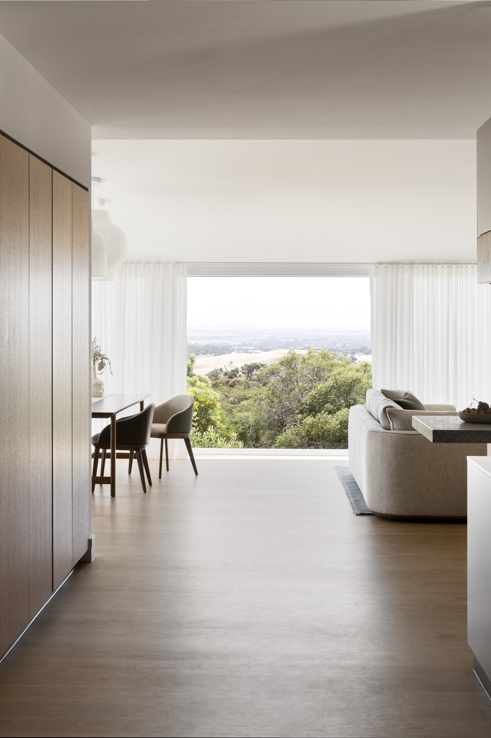
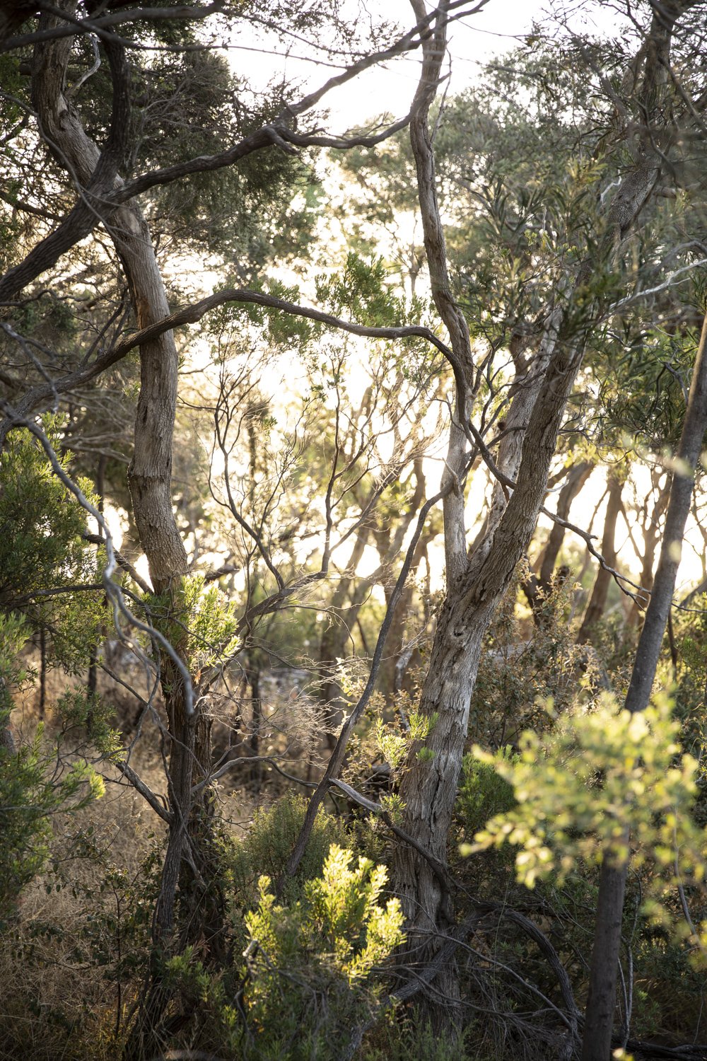
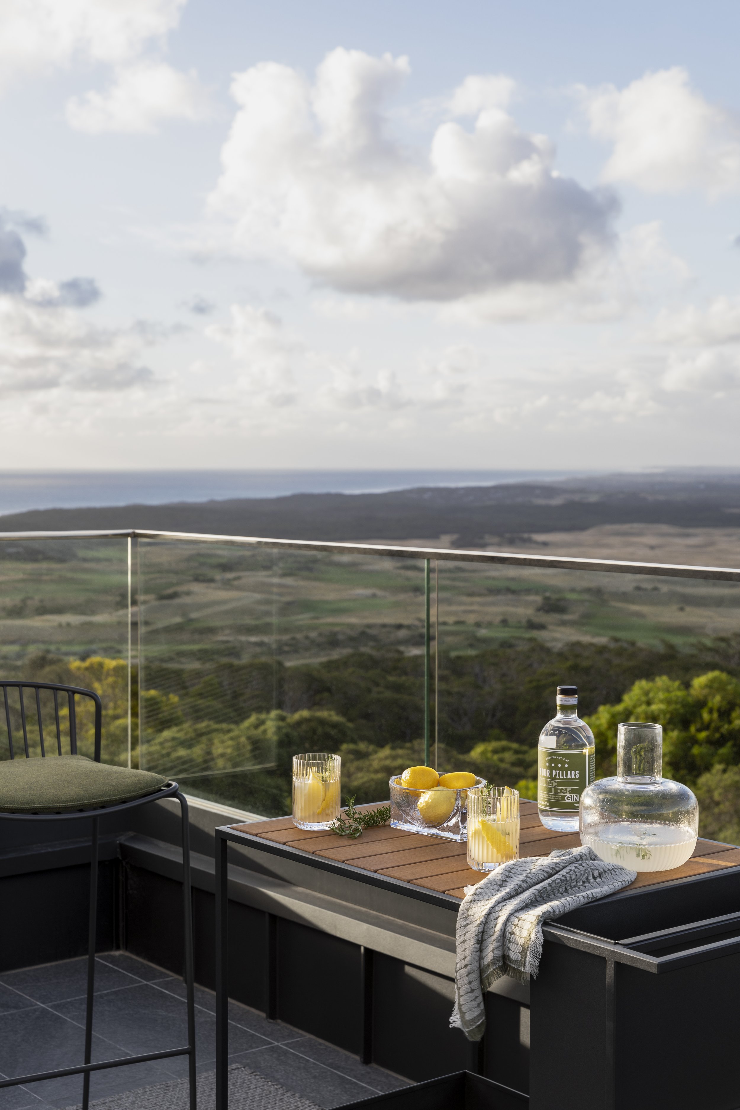
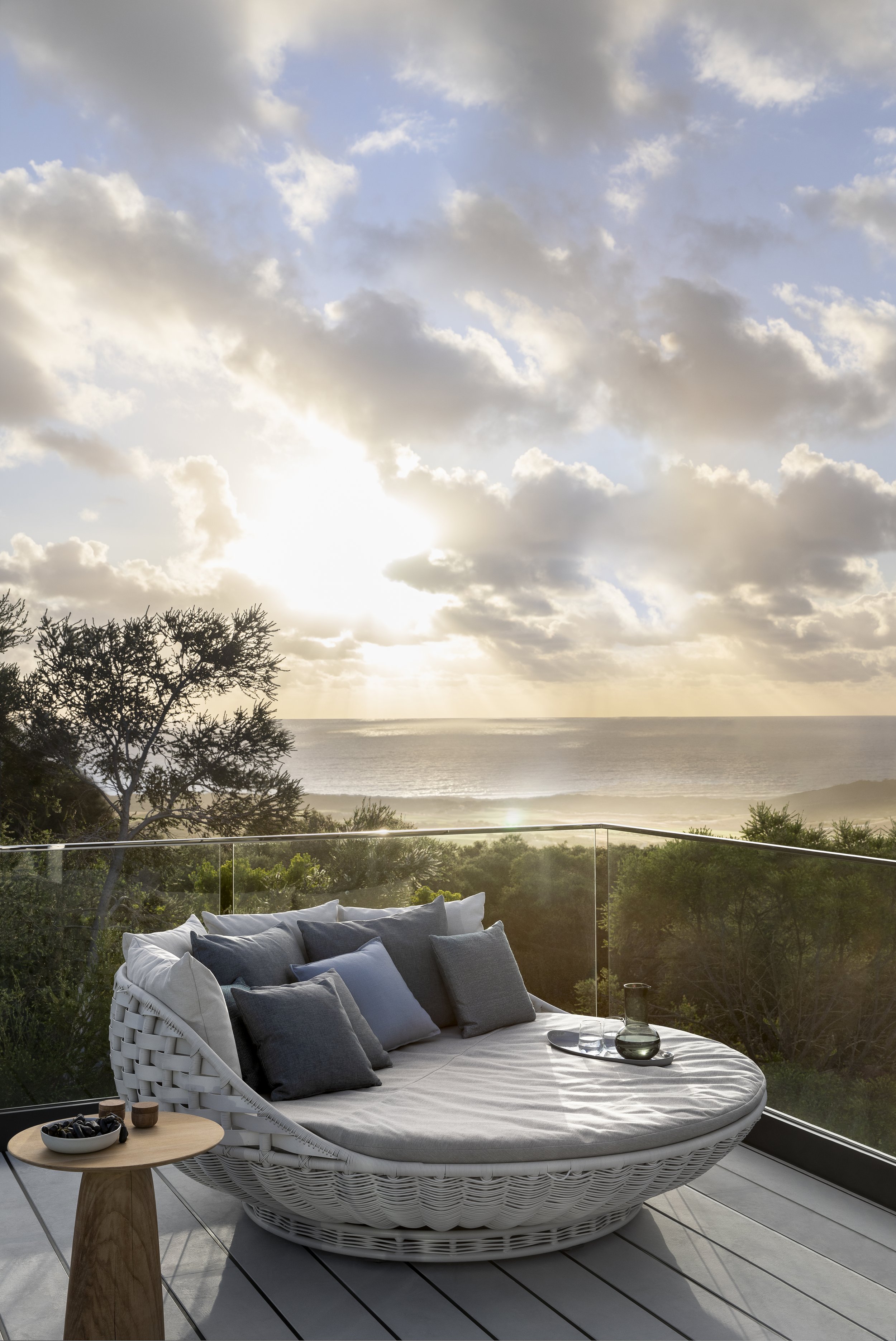
This quiet Cape Schanck home is poised above the escarpment of Gunnamatta Beach, with sweeping views along the farm and coast line, punctuated by the floating distant CBD appearing to hover on the horizon sky. Settled into the surrounds by native tea tree, striking against the dynamic light of the everchanging sky, the beauty of the location became a muse for the project.
Project
Cape Schanck House
System
K2 Kitchen System
Service
Whole Home &
Interiors
Author
Kylie Forbes
Location
Victoria
Images
Martina Gemmola
Styling by
Kylie Forbes
Project Collaborators
Anderson Homes
Rod Hannah Design Group
Solstice Lighting
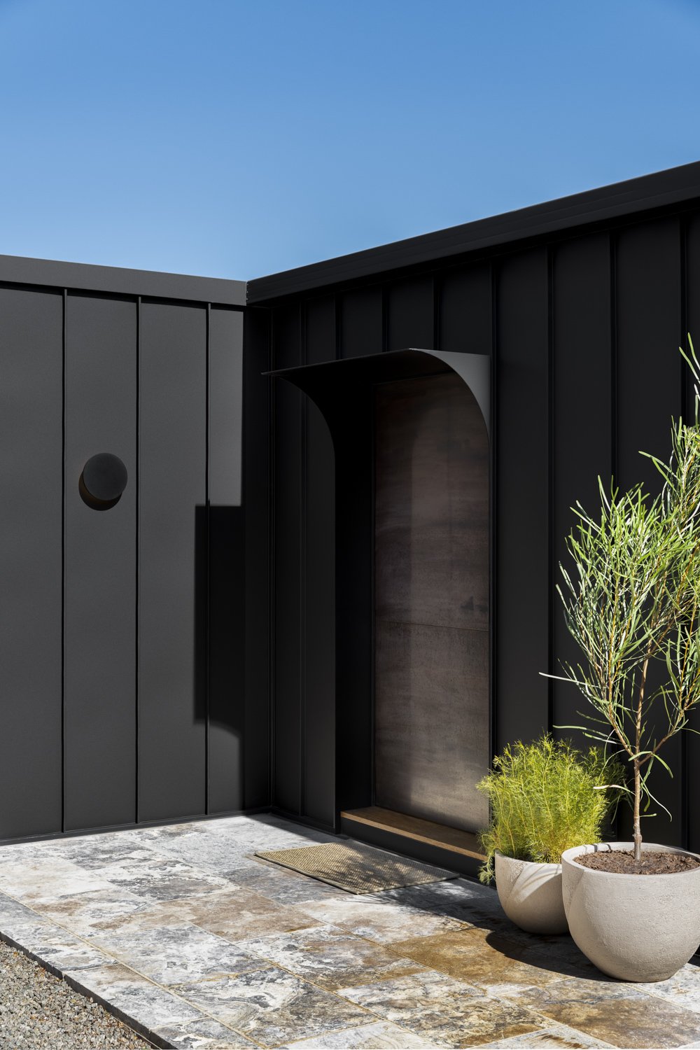
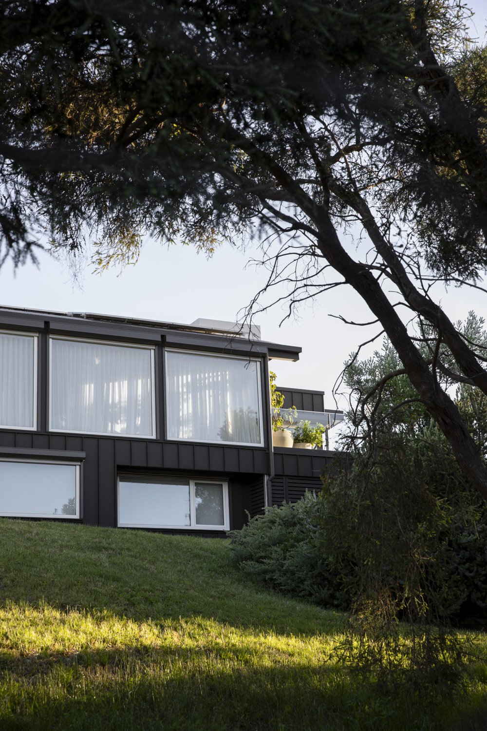
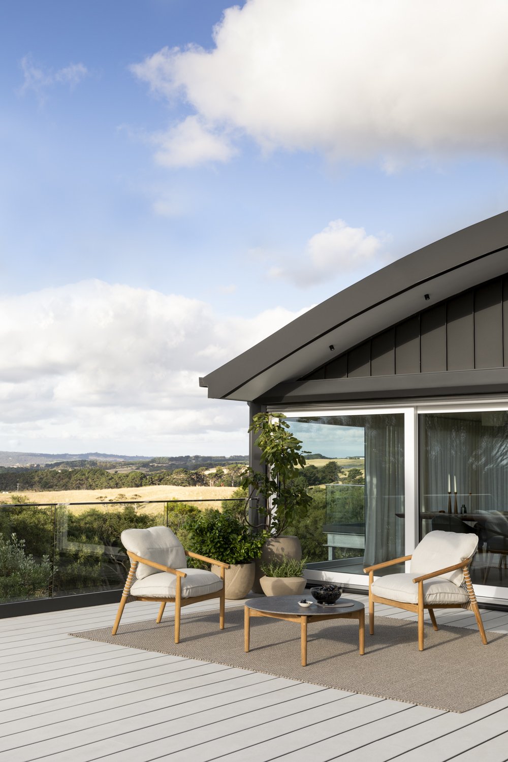
Nestled amongst the coastal scrub, the house design consists of an assemblage of stacked forms, with an exterior clad in moody black steel. From North to West, the outlook captures the vastness of the sea, the rugged Mornington Peninsula coastline and the softness of the idyllic green rolling hills that cover much of Cape Schanck. The homes original orientation was carefully planned on the undulating site, in recognition of the sun’s arc passing over the home. The positioning of outlooks, verandahs and room orientation maximised the sweeping views. In recognition of this lived experience, it was clear to home owner, Howard Webster, that these were the enduring qualities of the home that he never wanted to lose.
Howard, a plastic surgeon who practices in Melbourne, had made the decision many years prior that Cape Schanck was the place he and his wife, Meei intended to retire to. “It was when I started playing golf at Cape Schanck, that I realized I wanted to retire down there. I was late 40s at that stage, but I am always a bit of a planner.” After a long and considered search for the right property in the area, the ‘one’ became available. “I’m all about the view, I wanted a property with that triple A view.” Howard acted quickly and the Cape Schanck project was in motion.
The house was located in an enviable part of Cape Schanck, high enough to capture the coastal views, but also a unique triangular shape property that created the opportunity to look back over the surrounding countryside. A sweeping scenic abundance.
A family retreat for Howard and his adult children, the home was split across two levels that accommodated multiple living, sleeping and bathing quarters. The desire to update the tired original home was stimulated by the growing third generation of the family, and the possibility of accommodating everyone under the same roof, without compromise. Although open to the idea of a new build, the couple had lived in the original house and realized the importance of its existing orientation; “after living in it for a while we knew we wanted to renovate it rather than knock it down.”
The renovation was considerable. “I really wanted to do the view justice… It turned out to be a bigger project than I thought it would be at the beginning.” The project included major structural works, the floorplan design developed by Howard in collaboration with the drafting team at Rod Hannah Design Group. By retaining and extending the two levels, the lower level enlarged enough to be dedicated to hosting multiple groups of guests and family. The upper level encompassed the primary entertainment layer; including master suites, study, living, dining, theatre and at the heart of this revised layout, the kitchen. A rooftop deck was introduced, and landscaping converted to accommodate a pool.
Howard came to know Cantilever after extensive online research. He was taken with the aesthetic, “I really liked the use of wood and stone”. On visiting the showroom; “I just liked what I saw. I liked the materials, I liked the approach, I liked the people.” Cantilever were engaged for our whole home Joinery and Interior Design Service. The project offered a blank canvas requiring Interior detailing throughout, the scope encompassed a total of twenty-five spaces. Whilst Howard had a strong sense of the design outcome he wanted for his home, his brief was also broad enough to allow Cantilever the scope to bring their trademark aesthetic.
“I wanted all of the creative contributors to have the space to express their vision. That was my best ever decision.”
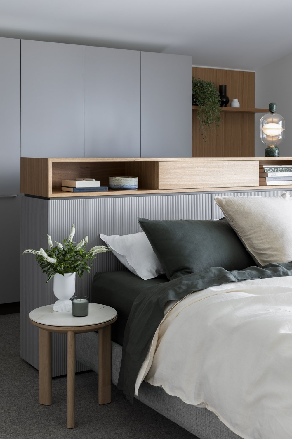
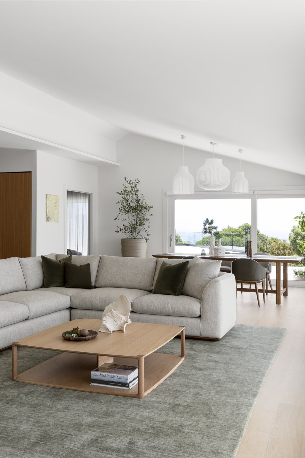
A combination of muted tones, and natural textures were chosen for the project palette, with the aim to enhance and compliment the views. Kylie, Cantilevers’ Creative Director, reflects on how the team achieved the design intent.
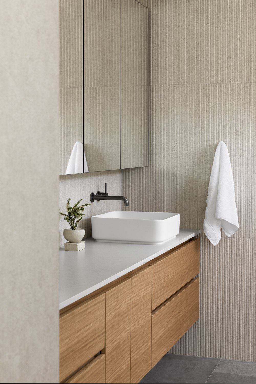
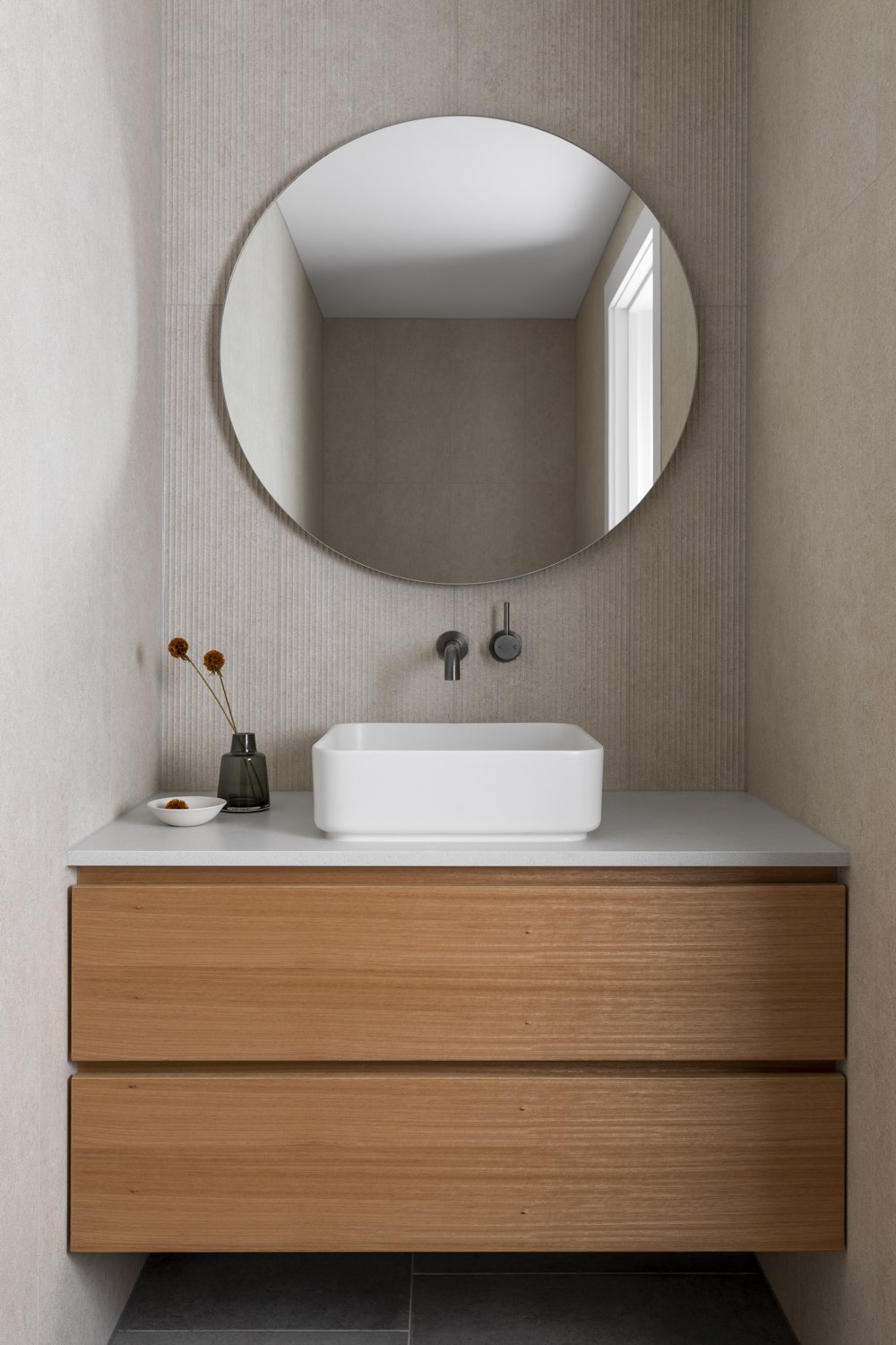
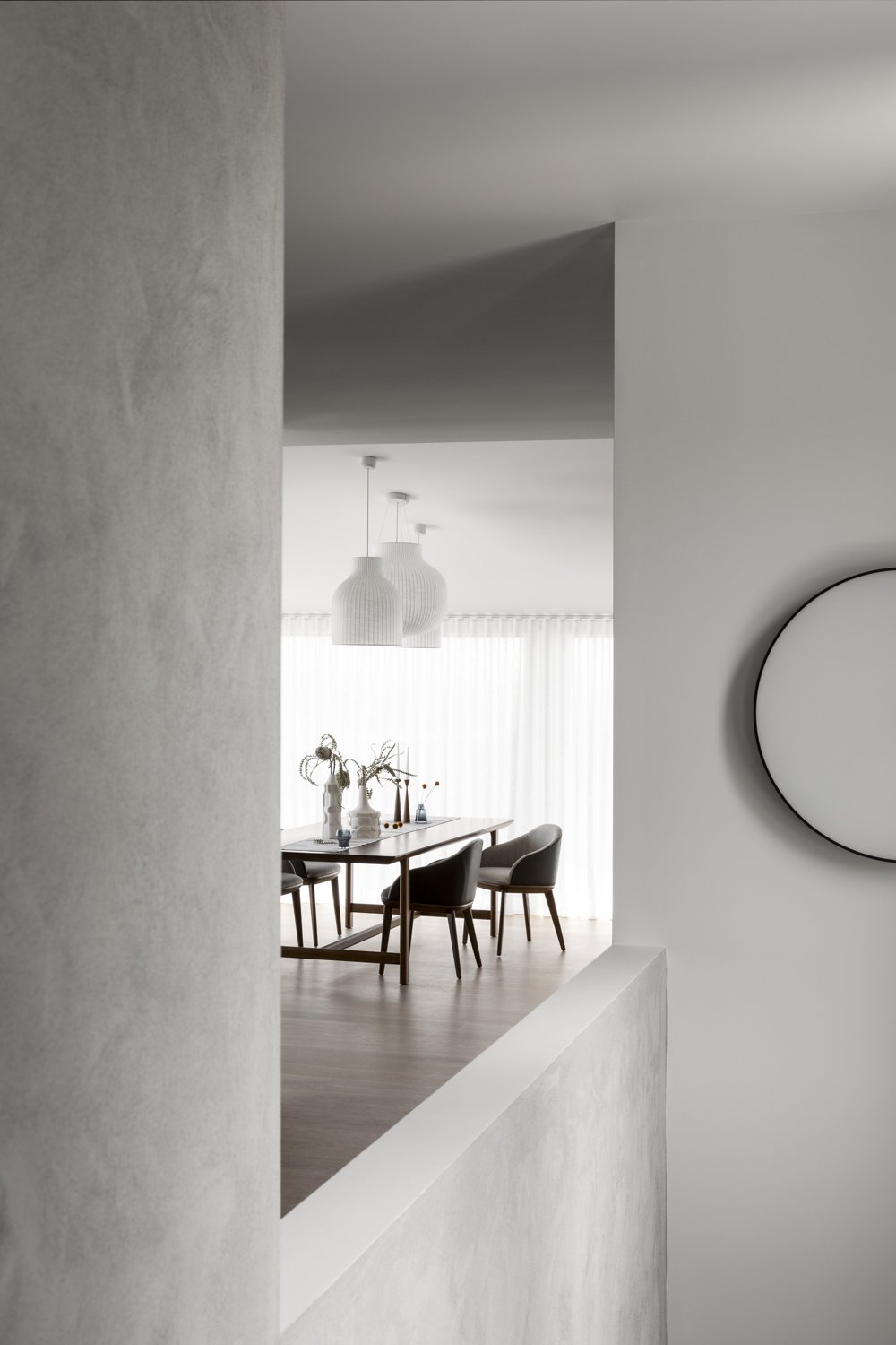
“Designing to create a palette of shifting light through the home, we worked subtle tonal shifts across white, cream, grey and taupe to create a calm, responsive environment which allowed the expansive landscape views to take center stage at every opportunity. Repetition of textural contrast is achieved through varied adjacent materials, like stone, steel, timber and tile.”
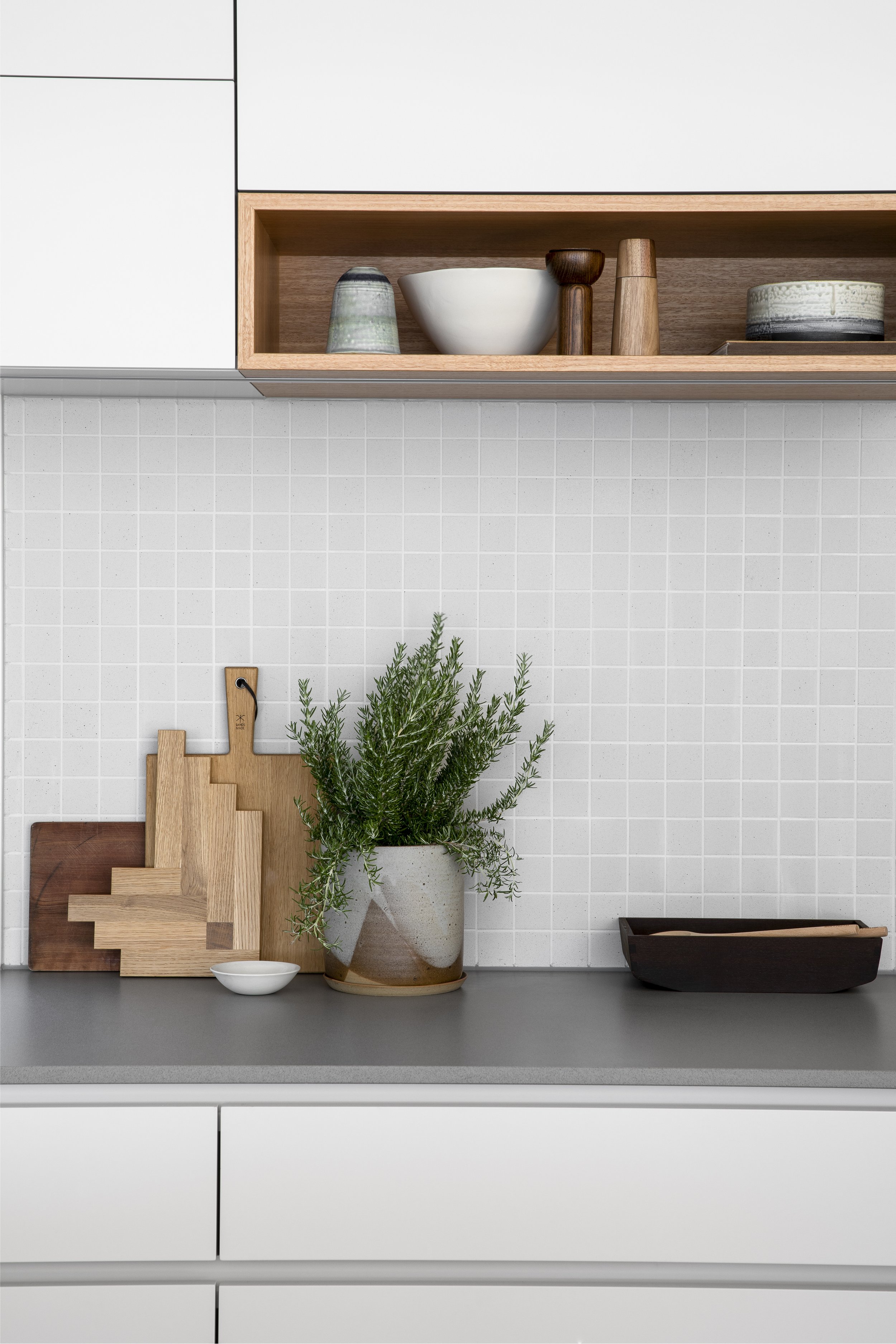
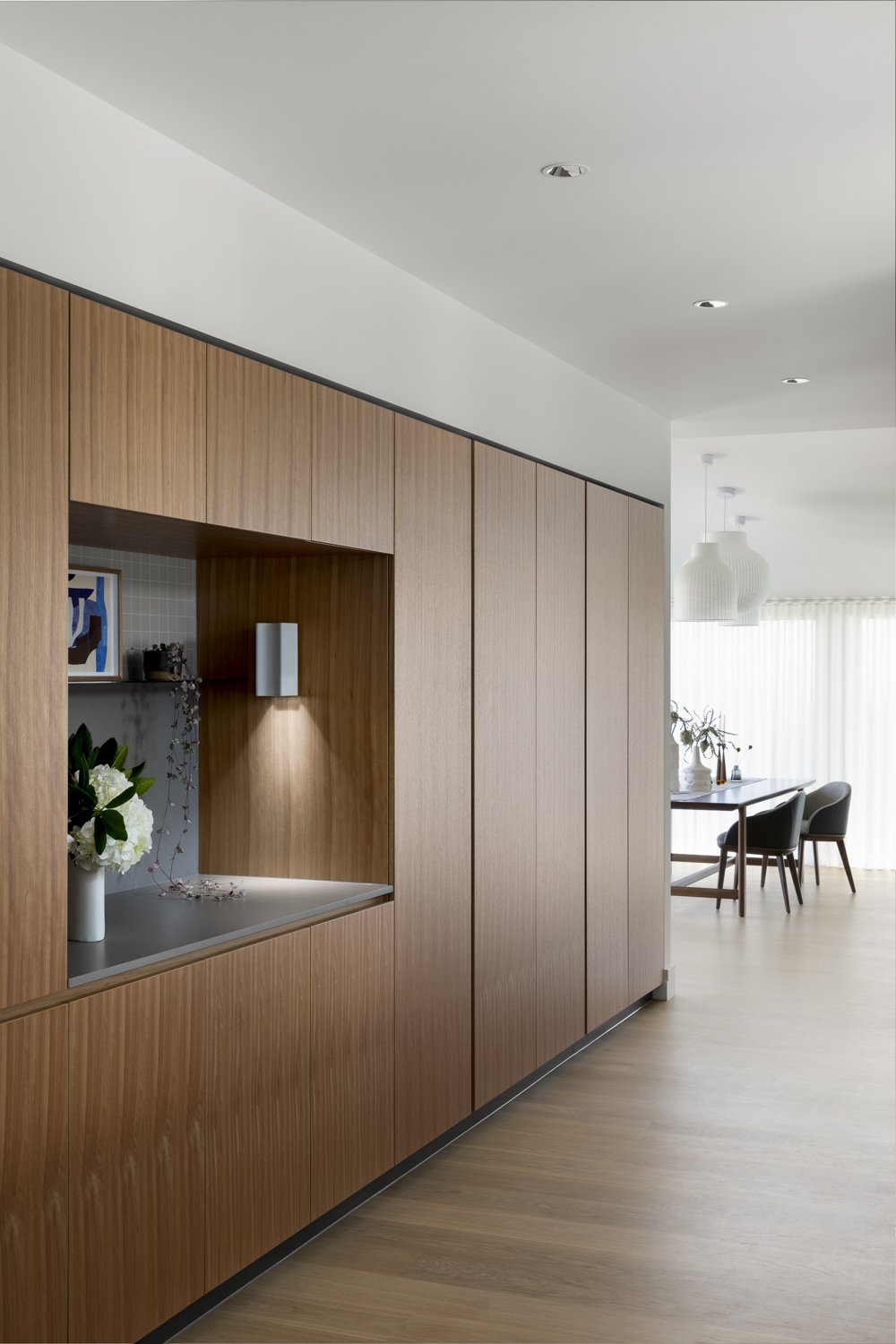
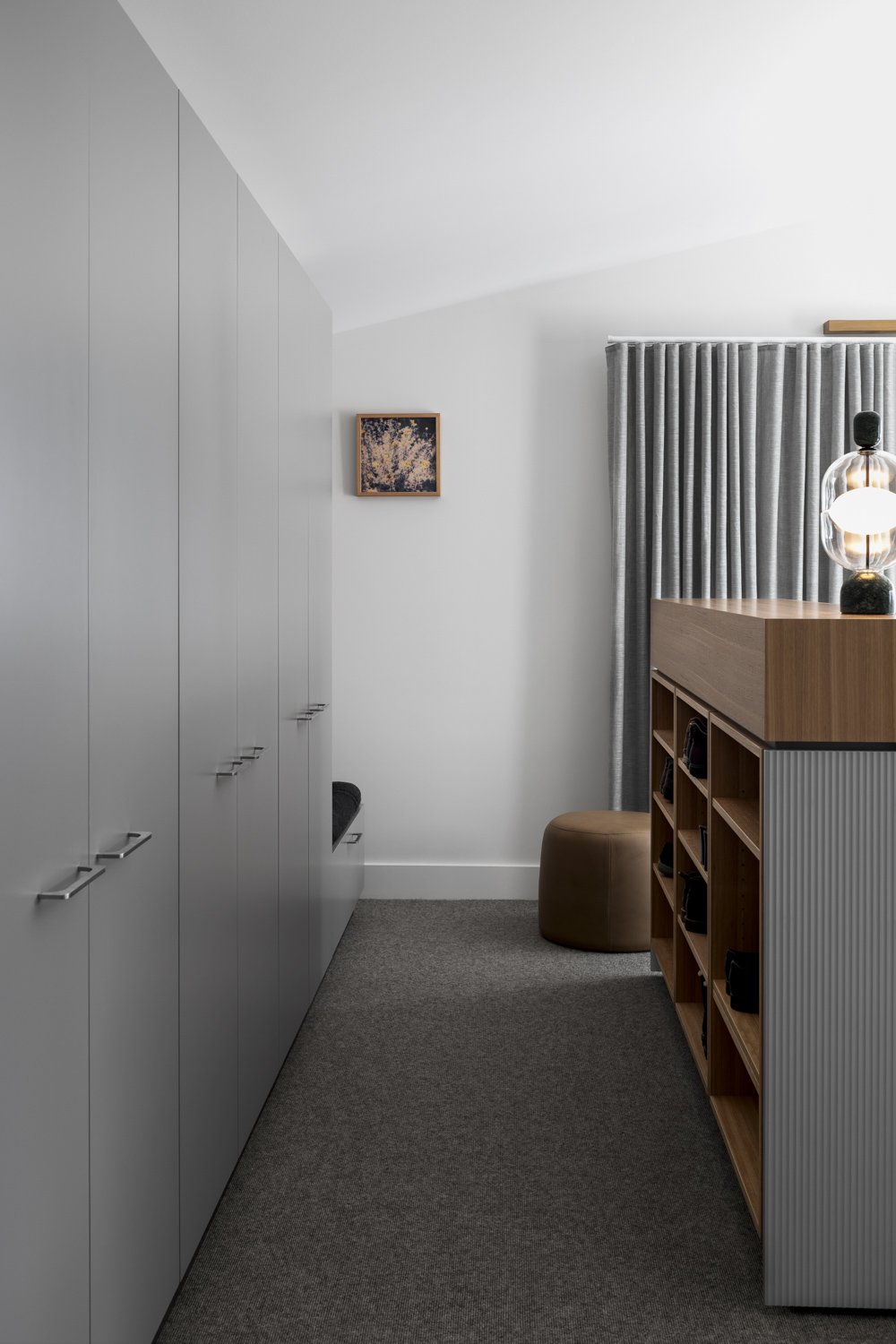
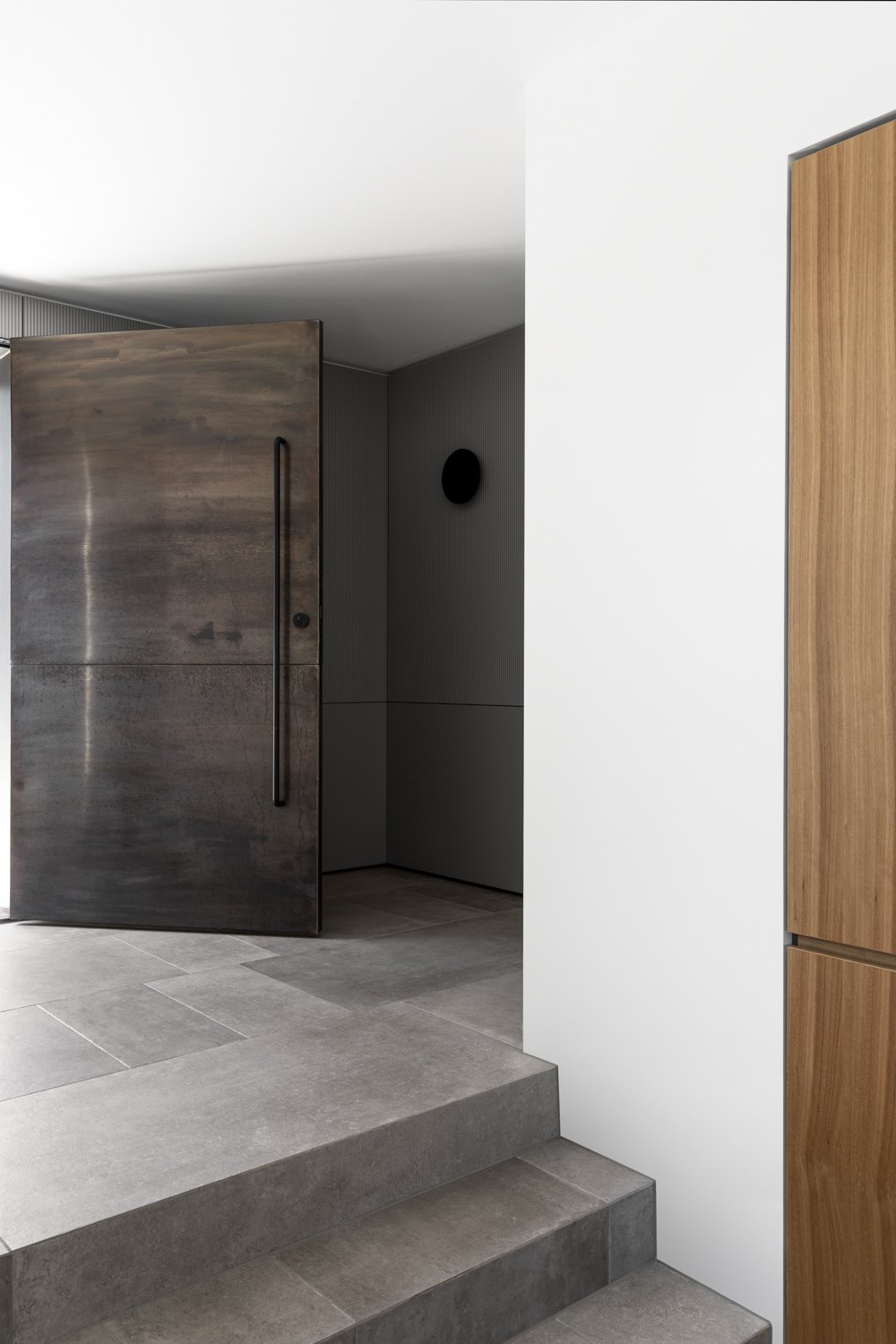
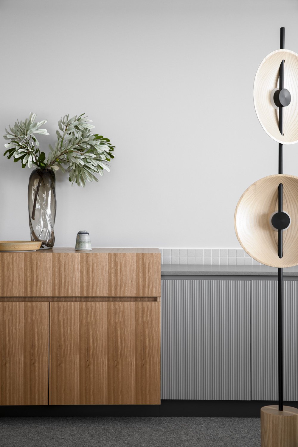
Cantilever K2 joinery system shines throughout, effortlessly blending stone and timber veneer to create a strong yet grounded palette. High quality, durable two pack joinery ties these powerful textures together in humble tones of mole grey and ghosting half. Creating seamless integration between the kitchen and the rest of the home, this palette is complemented throughout the entire interior, re-emerging in different forms and textures.
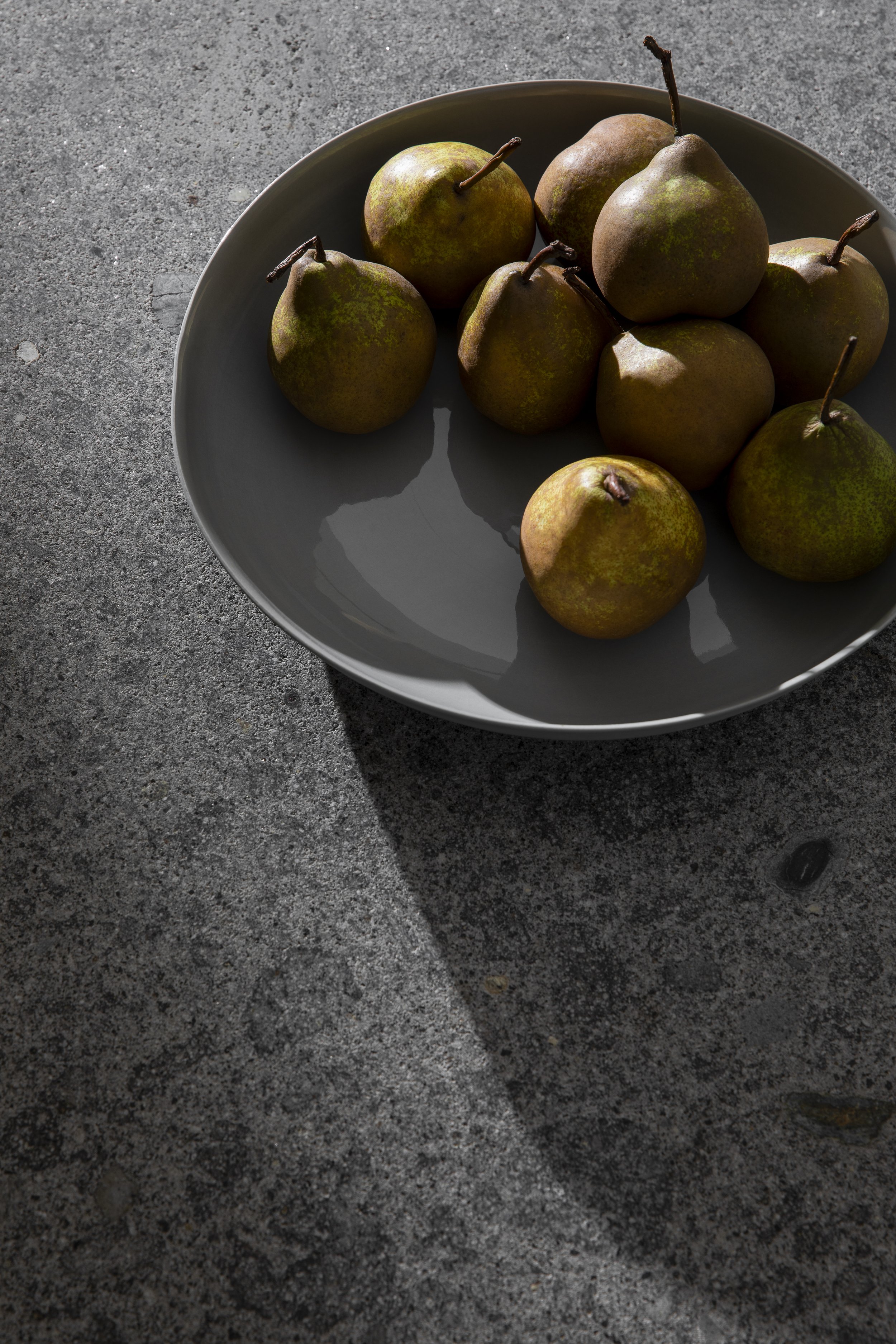
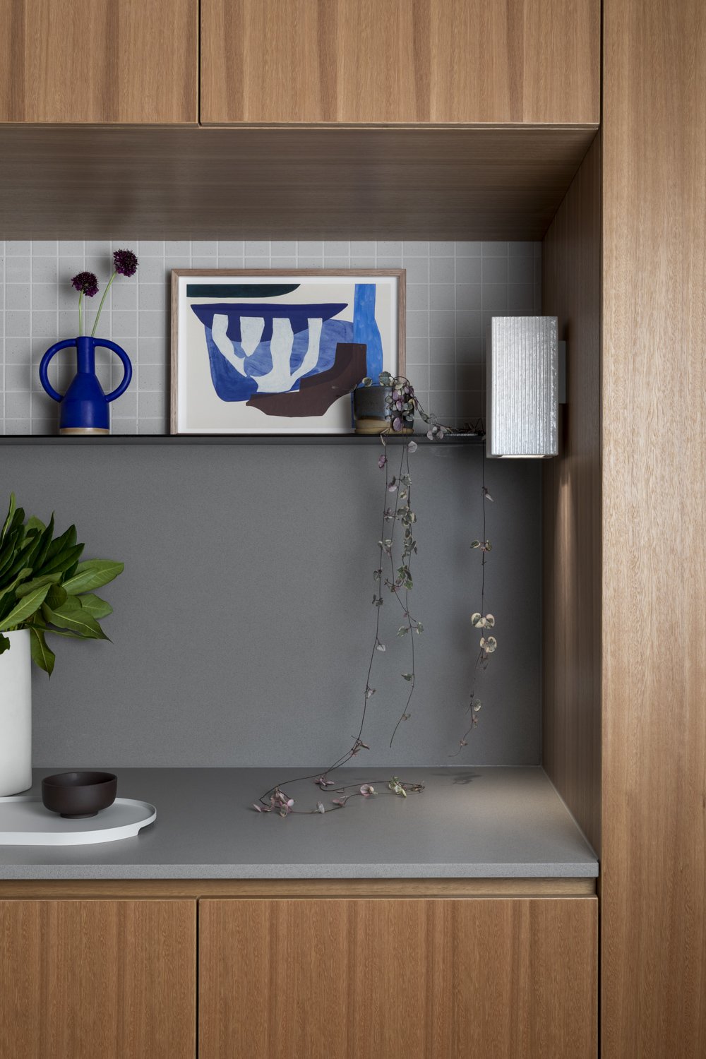
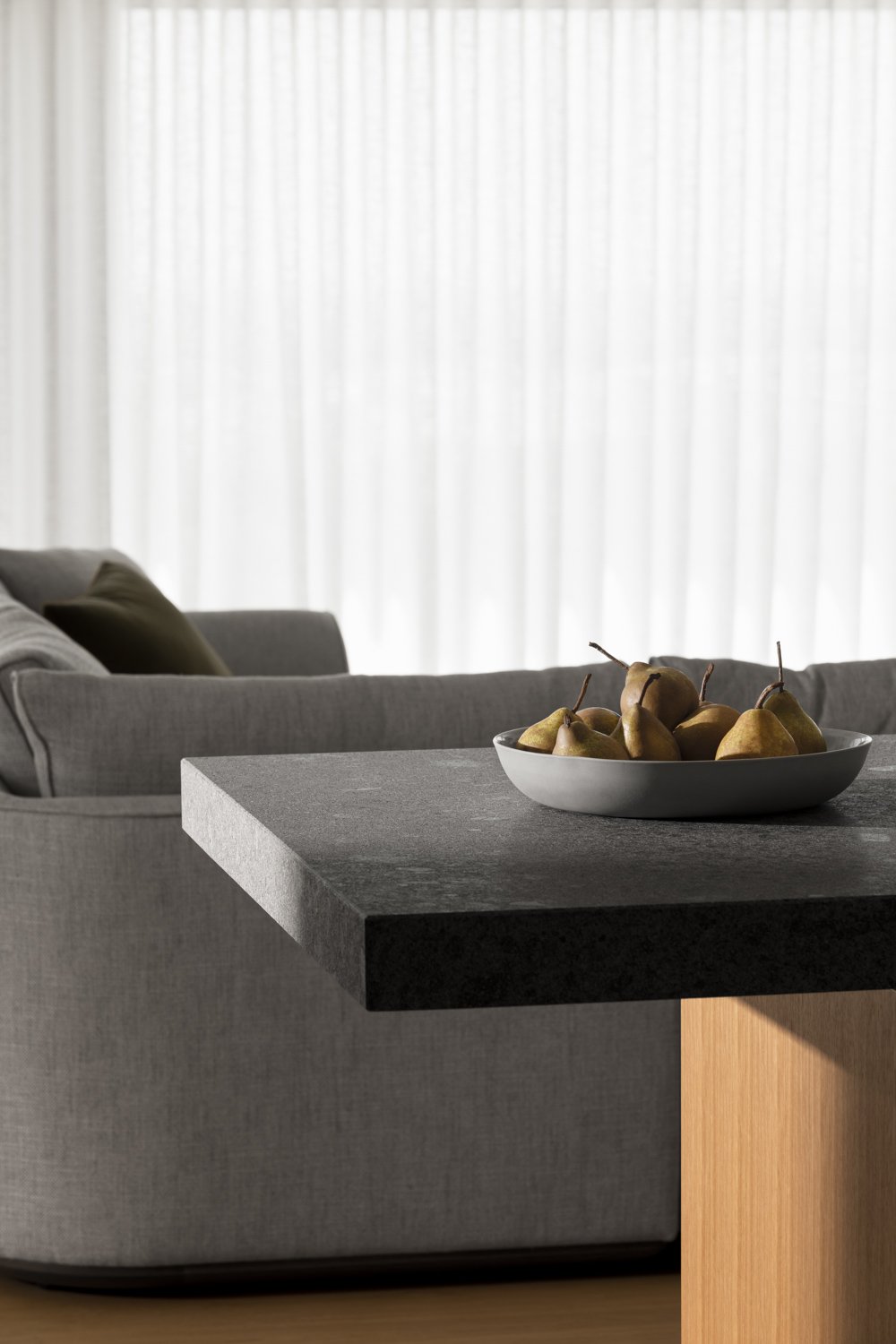
The flexibility of K2 material group allows endless variety of palette. The introduction of Pepperino Grigio Island benchtop referenced a clear feeling of Peninsula rock formations, the textured surface robust and enjoyable to the touch, in its honed format - the true expression of stone.
We chose Anchor Ceramic Potter DS Pendant in Charcoal glaze finish to compliment. The weighted ceramic tone of the piece offers balance to the form of the Island. Howard enjoys the ambience of this light offering lone, soft illumination in the evening.
“Lighting was really important to me. An inspiration was a restaurant called Del Posto in New York, one my favorites. Their lighting was so genius.”
The lighting is on a computerized system so it can be tailored in every room. Key project collaborator Simon, of Solstice Lighting worked to create a complex, resonant solution at every turn. Working with the feature lights chosen through the Interiors Service, and weaving further functional lighting solution into place.
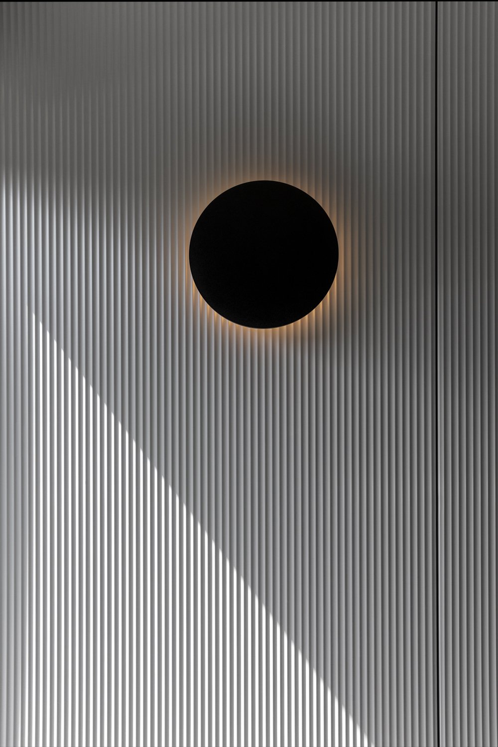
Kylie explains “The feature lights engage with the interior palette, form and texture throughout the project. The impact remained deliberately subtle throughout, to create a calm sensation, that is visually punctuated by the black fittings - contrasting and exaggerating the materials surrounding. I reference this like a bird’s silhouette in a sky, offering brief context of it’s volume.”
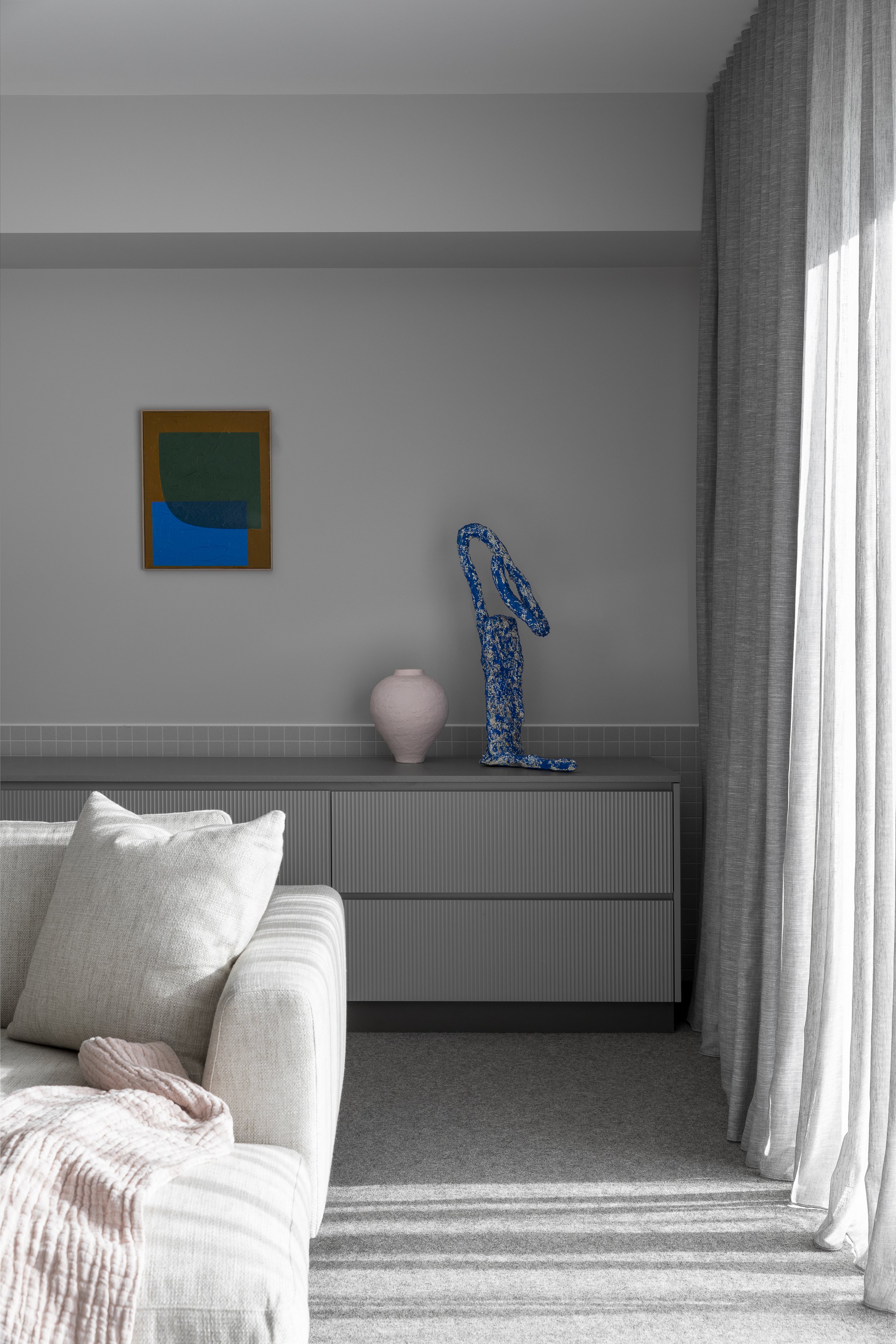
“The soft grey tones reference the tea tree surrounding the property and offer the same cooling, quiet retreat from the immense sky. They also offer a base from which colour can be introduced through object, furnishing and artworks.”
As with every project, joinery elements were designed to meet the practical and functional requirements of their location. The Entrance joinery bay offered a set down space through the detailed niche, and illumination feature light by Anchor Ceramics. Behind the scenes, cloak and cleaning equipment storage, and a discreet Liquor Niche with dedicated Wine Storage.
The Theatre room was designed to offer space to muse once the sun has set - dedicated to the enjoyment of music, cinema and fireplace reflection. Howard is a serious music enthusiast, hence joinery was designed to store record and CD collections and equipment, in compliment to the custom speaker set created by Osborn.
Cantilever approached the project through a combined lens of joinery specialization, and interior palette detailing. Combining furnishing, and function, to create a practical, resolved and restful home.
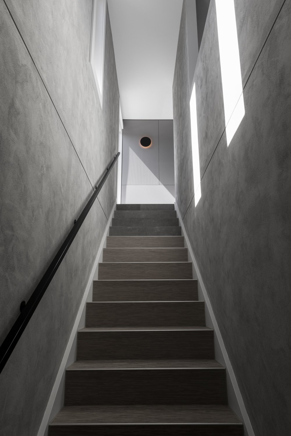
Kylie explains, “The use of textures is intended to give the interior space a sense of time and connection to the landscape outside, as light appearing through various portals throughout the day casts differing tones and shadows across each detail, punctuating the space as afternoon turns to evening. The routed lines that run up the joinery develop depth as the sun moves through the sky and tiptoes edgewise across the textured surface. The shifting light also picks up the variation in the stone benchtops, evoking the craggy coastline, while the repetition of mosaic tiles lends a sense of structure and pattern.” Howard loves the palette and use of texture.
“Each room has its own character. I like the flow of the house and I like the surfaces. I really like the kitchen and living space and sitting there just feels great because you have the expanse around it.”
The project was not without complication, a challenge that arose early in the timeline was bushfire zoning. Unfortunately, due to the properties location and surrounds it was rated by two independent assessors as being in a bushfire flame zone. This was a shock to all involved in the project and became very challenging in terms of material selections. The cost implications were significant. The project build was delivered by Anderson Homes, whose professional resolve to deliver the technical demands of the zoning, and work with new material and regulation, made the difference. To Howard’s credit, he was not deterred, researching and sourcing alternative, suitable material options, altering the exterior design and doing everything that was required to ensure the project could still go ahead. And that it did.
To fulfill the vision, Cantilever sourced furniture to compliment the palette, function and form of the spaces. A collection of pieces were chosen from Cosh Living, engaging selections of indoor and outdoor pieces, across International brands Tribu, Dedon and local, Australian Kett. The subtle use of curved forms, fine detailing, weaving and enduring quality of material and craftmanship across the range perfectly complimented the design brief.
Enduring a build that took place throughout covid, amongst many other arising issues, Howard reflects on the process and the end result fondly. “I think we really nailed the brief and I feel really proud of the end result. Cantilever was a big contributor to the project. The result is beyond what I could have expected and imagined.”
After much thought, hard work and plenty of heart, Howard has managed to create a beautiful space for his family to escape their city lives, and eventually for he and Meei to reside in. The creation of a stately, strong exterior, with an elegant, homely warmth and calm that emits from within. It really is the perfect place to relax and soak up the picturesque and seasonal panorama.
“The house just has a great feel, every time you walk in, it lifts your heart and you think its so nice to be here. We hate leaving it.”


